Web fonts are fonts that have been saved in a format that works on the web. They are accessed from a server via the @font-face declaration. They are accessed two ways: self serve or using a provider.
Web Font Providers
If you don’t want to deal with the @font-face declaration, you can work with web font providers. They host the web fonts on their servers, and take care of the @font-face declaration behind the scenes.
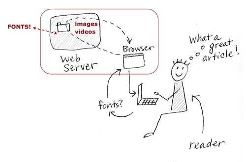
Using the @font-face declaration, web font providers host fonts for you, serving them to your web site.
In this lesson, you will choose and apply a google web font (text font) to the final bibliography from the last exercise.
Overview of the Assignment
- Make a copy of your bibliography_display folder. Rename it bibliography_google. Rename your CSS file bibliography_google.css, and link to it.
- Go to Google Fonts and choose a text font of your choice. Many kinds of fonts are available; choose one that has an italic style (for the titles in your bibliography) has a bold weight (if you need it for your headings or strong text), and works with your display face. (Note: you can also choose to change your display face.)
- Follow the instructions for using the web fonts (outlined below).
- Adjust the size, weight, and case of <h1>, <h2>, and <p> as needed, so the headings and text work together in a system.
Getting Started
Make a Copy of the Last Lesson Folder
In this exercise, you modify the final bibliography from the last lesson, so make a copy of that lesson’s folder (bibiography_display), and name the new folder bibliography_google. Keep the new folder inside your web_typography folder.
Set Up Your Files
Rename the CSS file bibliography_google.css. Link it to the index.html file by going into the HTML file and changing the syntax in the head element to the following:
<link href="bibliography_google.css" rel="stylesheet" type="text/css">
Change the title to
<title>Bibliography with a Google Font</title>
About Google Fonts
Google Fonts is a web font provider.They take care of the @font-face syntax, and provide you with simple cut and paste code to get the fonts working immediately. There are many web font providers. They don’t all work exactly the same way. But if you know how to use @font-face, and you know how to use Google Fonts, you’ll find it easier to learn how to use other services.
Pick a Font
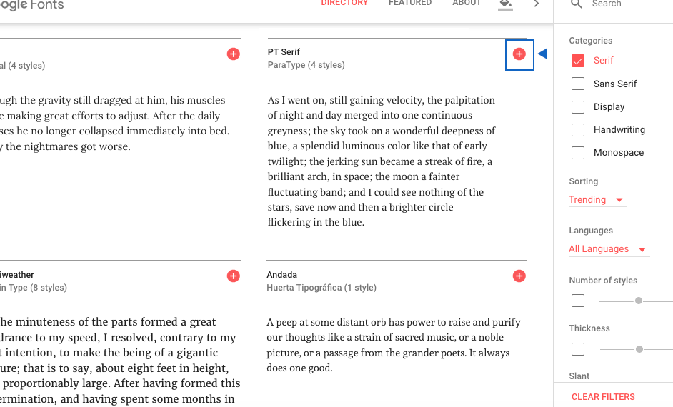
Go to Google Fonts to look for a font for your text.Google Fonts has over 800 options to choose from. Use the filter on the right side to narrow down the options. For example, if you know you want a Serif font, turn off all categories except Serif!
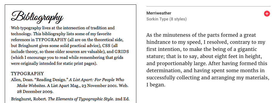
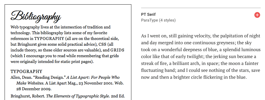
Get a sense of whether certain fonts might work with your text type. Choose a font’s “paragraph” option to see how the fonts look in a paragraph. Keep an eye on how many styles the font family has. You’ll need at least an italic for the titles in your bibliography text.
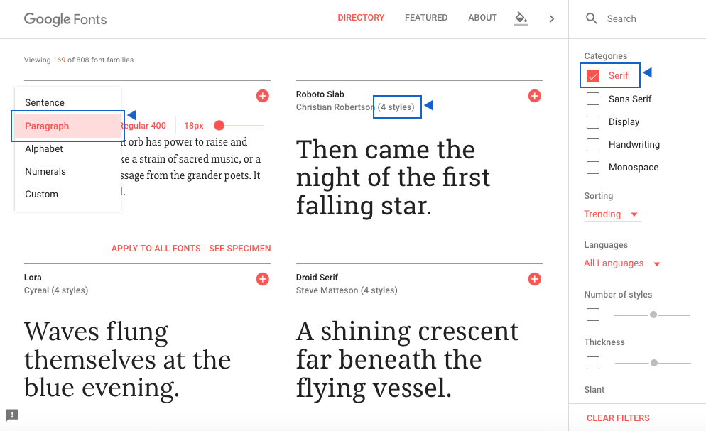
With over 700 fonts to choose from, use the filters to narrow down your search. Choose the best context for looking at fonts: word, sentence, or paragraph. Keep an eye on how many styles a font has. If you need bold and italic, you’ll need at least three styles.
You’re picking a font to use with the display font you chose in the last lesson. It’s easier to do if you can see both the display font and the text font options at the same time. One method is to open the current index.html file in your browser (since you haven’t made any changes, it should look exactly like it did when you finished the last lesson), and compare it to available font options.
When comparing the display and text fonts, look at the usual elements: x-height, bowl, weights and/or contrast in weights of the strokes, and shape of serif (if any). You want a text font that contrasts the display font, but with some similarities so they don’t feel too different.
Select the Font Family
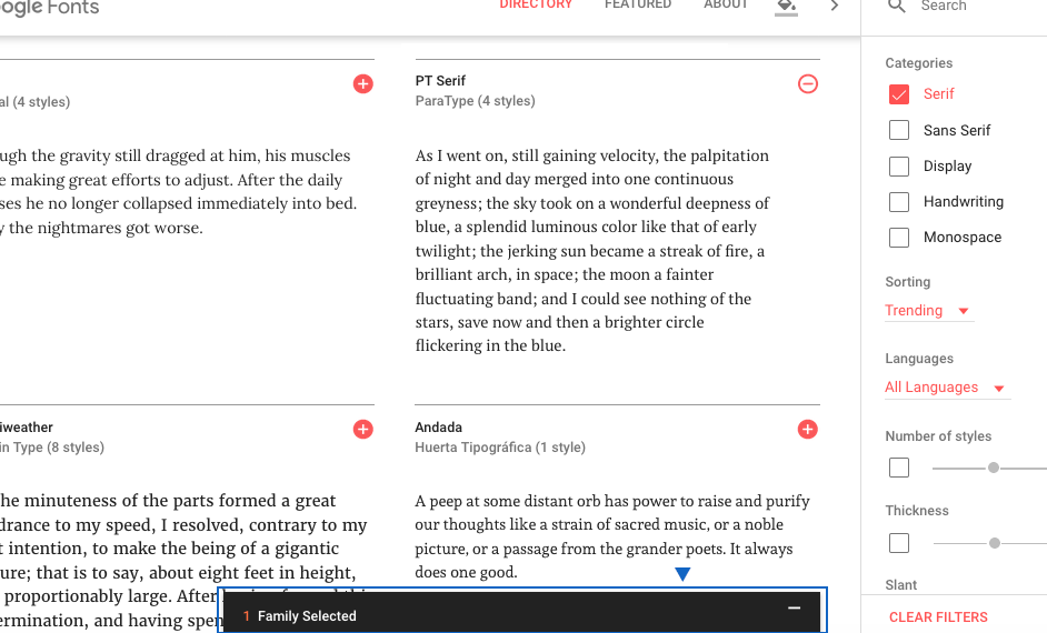
Once you’ve picked a font, select the font family by clicking on the red circle with the plus sign in it.The symbol will change into a negative sign in a white circle… and a black bar will show up at the bottom of the screen, showing you have a font family selected. Click on the black bar to open a hidden window.
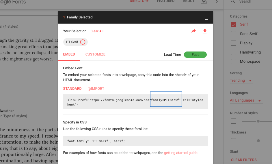
The window tells you how to use the font. But Wait! How do you know all the styles and weights will be added to your web page? Look carefully at the syntax Google Fonts tells you to use. Mine only mentions PT Serif (not bold or italic).
Choose the Style, Weight, and Character Set
Click the Customize tab to choose the styles and weights you want to use.Don’t select more than you need. Every weight and style slows down page loading. The font I’m using has four styles. But I only need to use two of them.
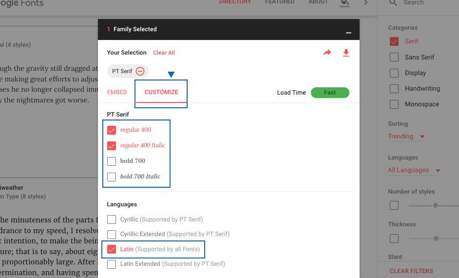
Only select the weights and styles you need. Otherwise, your page will load slowly. Choose the alphabet your text uses.
Under “Languages” choose the alphabet your page uses. Here, I’ve chosen Latin. Some fonts offer a Latin Extended character set, which includes more characters and allows your text to translate into additional languages (Czech, Polish, Turkish, and so on). Beware! The Latin Extended doesn’t work correctly in all Google Fonts. Always test a new font. Latin Extended is not necessary for this lesson.
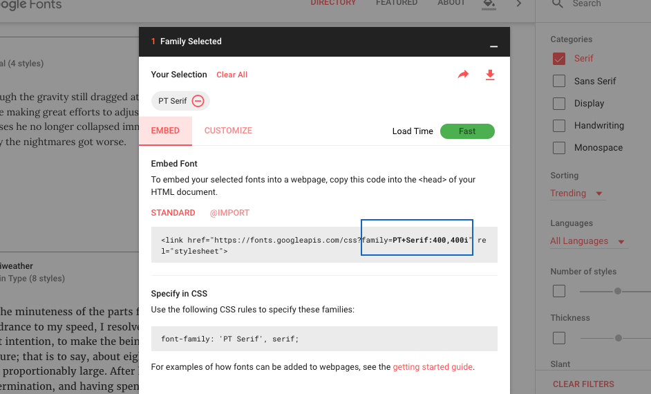
Back at the “Embed” tab, you can see the change in the syntax. Mine now specifies both the regular weight (400) and regular weight italic (400i).
Copy and Paste Syntax
For this lesson, use the standard embed syntax.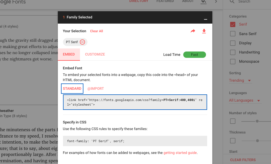
The standard embed syntax can be copied and then pasted as the first item in the head of your HTML page.
- Making sure you have the standard tab selected, select and copy the code in the box provided (see above).
- In your HTML file, paste the code as the first item in the <head> of the file, and save.
- Back at embed window, copy the name of the font you’ve chosen to use — including the quotation marks (see below).
- In your CSS file, paste the name of the font into the h2 style and the p style, and save.
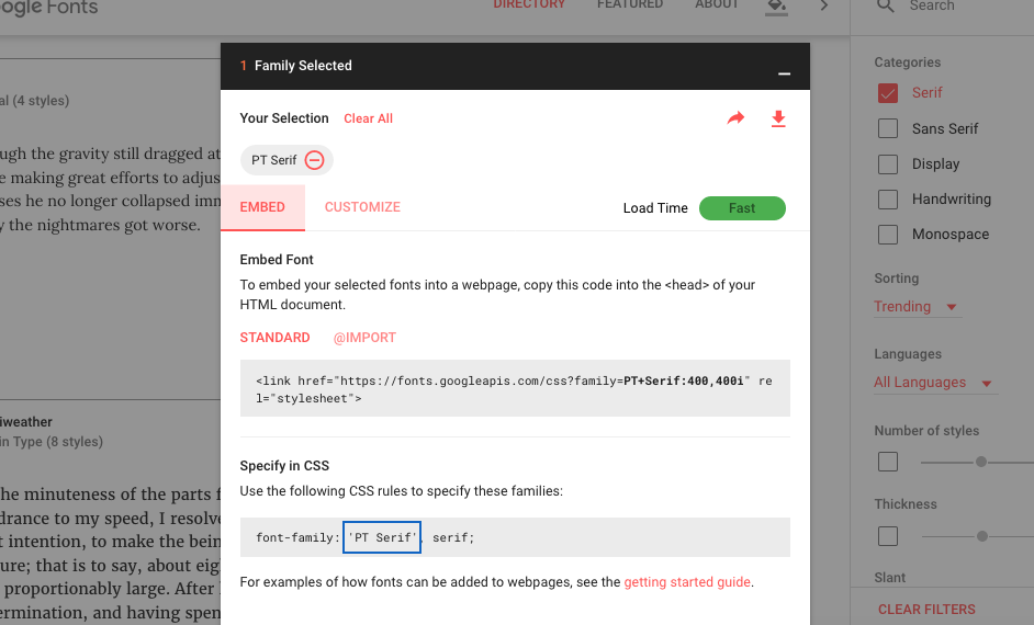
The name of the font-family, including quotation marks, can be copied and then pasted into your CSS wherever you’re using it.
- Make sure you make a font stack. (I used Georgia as my fallback font.)
h2{
     font-family:'PT Serif', georgia;
     }
p{
     font-family:'PT Serif', georgia;
     }
View Your Page
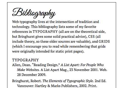
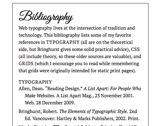
Open the new bibliography page in your browser. The new font should load, and the bolds and italics should work as well.
Beware Fake Bold and Italic
If you use a font that is not a bold weight and add font-weight bold in the CSS,the browser will “fake” the bold — stretching the vertical strokes so they are thicker. If you use a font that is not italic and add font-style italic in the CSS, the browser will “fake” the italic — slanting the letters over to the right. Keep your weights and styles consistent.
Since you are only adding italic (and maybe one other weight or style) of a Google Font for this assignment, everything should work like a dream — as long as you don’t incorrectly add italic or bold. In the future, if you use multiple weights and styles with Google Fonts, you can learn how to do it correctly (so it works cross browser) from this article I wrote about Avoiding Faux Weights and Styles with Google Web Fonts for Smashing Magazine.
Make Changes as Needed
Do your h2 and p work with the new font? Do they need to be bigger or smaller? Also look at the h1. Make changes as needed.
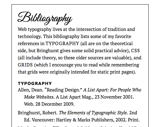
I could have kept the h2 set as PT Serif, but changing them to Verdana bold is another option. The heavy strokes in the sans serif bold works nicely with the heavy strokes in Great Vibes (the script font).
Validate Your Files
Once you have your h2 and p (text) working with a google font, validate your files. Use validator.w3.org for your HTML, and jigsaw.w3.org/css-validator for your CSS.
Quick Tips
Web fonts…
- Can be served to your web site from a third-party web font provider. They’ll take care of the @font-face declaration so you don’t have to.
CSS Resources
- Problems? Check out my Frequently Asked Questions page.
- Need syntax for a property I haven’t covered? Try HTML Dog.
- Want a CSS cheat sheet (2017) at your side? Just download and print!
- Using more than four weights and styles with Google Web Fonts? Check out “Avoiding Faux Weights and Styles with Google Web Fonts” by Laura Franz.
Project Resources
- Make a copy of your bibliography_display folder from the last lesson to do this lesson.
