Readers need information to be “chunked” for them, visually separated or grouped, so they can skip ahead if what they seek isn’t in the current section. They need these chunks laid out in a consistent manner, so if they skip to the next section, they know what to expect.
One way to chunk text is hierarchy. Systems of hierarchy need similarity.
Similarity
The principle of similarity is simple: we read things similar to each other as belonging together. For example, in a crowded park, if you see two or three people wearing the same clothes, you might assume they are from the same club or team.
We also read things similar to each other as serving the same purpose. In a crowded store, if you see two or three people wearing the same outfit, you might assume they are employees of the store, available to help you in some way. If the employees are all busy with other patrons, you’ll gaze around, looking for someone else dressed the same way.
Similarity is a fundamental element in typographic web design. In the bibliography lesson, you used similarity to choose a second font for the display face. Later, you’ll use similarity to indicate related information across multiple pages. In this chapter, you’ll use similarity to create a system of hierarchy.
Hierarchy
Complex texts have subdivisions. For example, the resume is divided into main sections (e.g., Professional Experience), then companies/employers, then title/position. Each division has a heading.
For readers to clearly recognize subdivisions, each heading level must feel less important than the one above it. Headline Two (h2) is subordinate to Headline One (h1), Headline Three (h3) is subordinate to Headline Two (h2), and so on.
Thus, similarity needs to be balanced with contrast.
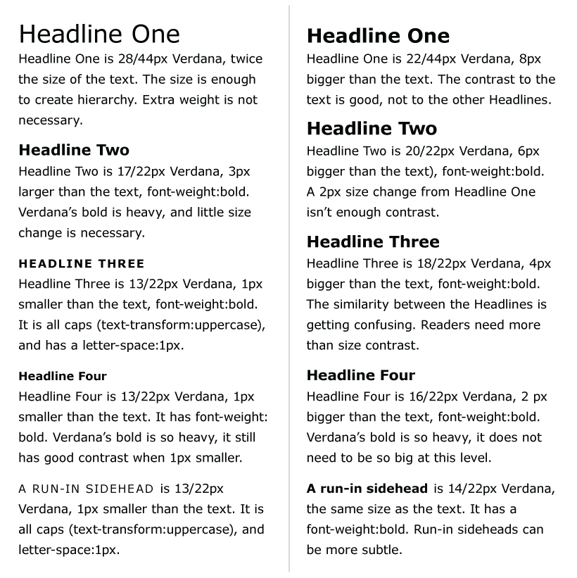
Left: Each heading level is subordinate to the one above it, and contrast and similarity are woven into a system. Four sizes and two elements (bold and caps) are carefully combined to create hierarchy. Right: Five sizes and only one element (bold) create a system without enough contrast. It’s hard to tell which level is subordinate.
Most texts will only have three levels of subdivisions (four including the overall title of the piece). Nonetheless, you should always read the text and create as many heading levels as needed.
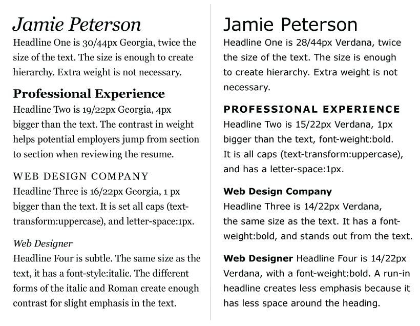
Two examples of four levels of hierarchy. Left: Choose styles appropriate for the content. I used italic for the fourth-level headings because they are the position / title and can be subtle. Then I made Headline One italic because it made a nice connection between Jamie’s name and titles (Jamie Peterson, Web Designer). Right: I used bold for the third-level heading instead of all caps. Sometimes companies use a specific case in their name (e.g. FedEx), so all caps (FEDEX) might not be appropriate.
Consistency, Similarity, and Contrast,
Apply a visual hierarchy system consistently throughout the text. This helps guide readers from section to section. A person scanning the resume quickly learn what a main section looks like, and can jump from section to section, ignoring the other text on the screen if needed. This is a function of similarity, because all main sections look the same.
Similarity also promotes contrast. When heading levels are developed with similarity in mind, they create a more effective system. If headings are all different from each other, it is hard to see how they are related. Hierarchy gets lost in the chaos of different fonts, font sizes, cases, styles, weights, colors, and positions.
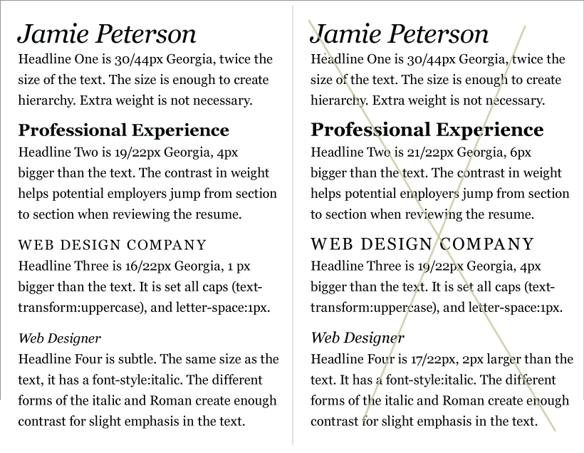
Left: Contrast and similarity are carefully woven into a system. Four sizes (to allow for subtle size changes) and three elements (bold, italic, and caps) are combined to create hierarchy. Working with so many differences is not easy, and it can backfire. Right: Four sizes and the same three elements create chaos. With so many sizes, headings 2 and 3 start to compete with each other.
Adding a Second Font
If you want to, try adding a second font for your main title and some of your headlines. A display font can add an aesthetic/emotional layer of meaning to your page.
A second font won’t communicate, “awesome Web Designer, hire me,” but it might support the notion of “personal” or “creative.” On the other hand, using only one font family can communicate a sophisticated understanding of type. So either approach is fine.
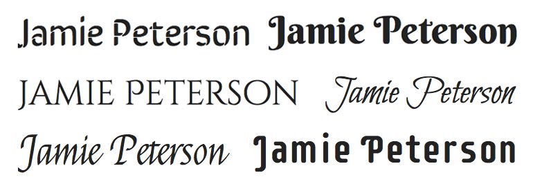
Capture and compare fonts. What fonts at fontsquirrel.com or Google Fonts feel right to you? Some won’t work (too heavy, too wide, not the right aesthetic), but you won’t know what works until you try. Take screen shots of possible fonts and narrow down your options before testing the fonts and then moving on to HTML/CSS. Top Row: Sirin Stencil, Berkshire Swash. Middle Row: Cinzel Decorative, Bilbo Swash Caps. Bottom Row: Felipa, Supermercado One.
It’s not necessary to use a second font for every level of hierarchy. Weave it into the system, paying attention to how it works at different sizes and when it feels stronger or subordinate to the first font.
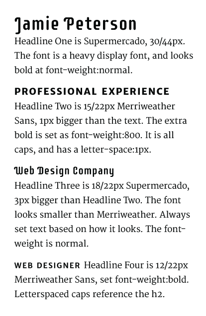
Four levels of headings. The text is Merriweather (which I’m using for my version of the resume). Top to bottom: the headings are Supermercado, Merriweather Sans Extra Bold, Supermercado, and Merriweather Sans Bold.
Continue thinking of the main sections, companies, and positions as a system. Do the sizes, weights, case, style, and positioning still work with a second font? Do you need to change the system in any way?
If the text font you’ve been using doesn’t work with the new font, don’t use them together. If you’ve fallen in love with the display font, change your text font. You might need to re-evaluate the line length, font size, line height, vertical spacing system, and system of hierarchy, but it will be worth it.
Remember, it’s OK to work with one font family too! A more subtle use of type can communicate sophistication and elegance (even with sans serif fonts).
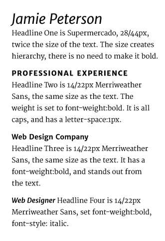
Four levels of headings. The text is Merriweather (which I’m using for my version of the resume). Top to bottom: the headings are Merriweather Sans Italic, Merriweather Sans Extra Bold, Merriweather Sans Bold, and Merriweather Sans Bold Italic. Extended font families provide contrast options.
Clear contrast helps your reader see which headings are more important than others, and will prevent your reader from mistaking one heading for another.
Quick Tips
When creating hierarchy
- Use as many heading levels as the text needs—no more, no less.
- Each heading level should feel subordinate to the one above it.
- Use headings in a similar manner throughout the text. Don’t swap heading two and heading three halfway through.
- If heading levels are too similar to each other, hierarchy is difficult to see.
- If heading levels are all completely different from one another (with no similarities woven into the system), hierarchy is difficult to see.
- Adding a second font might change everything in the system. Be willing and ready to make changes.
If you want to learn more about creating hierarchy, I recommend
- “Type Study: Typographic Hierarchy” by Frank Chimero