Without a responsive layout, text gets too small to read on small devices. And, if a reader pinches and zooms — increases the page size on their phone — text gets cuts off… forcing the reader to scroll back and forth to read.
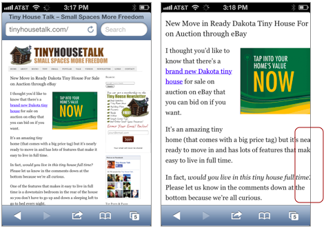
Left: a non-responsive site is too small to read on my iPhone. Right: when I zoom in to read, the text gets cut off.
Text should be readable on various devices and browser windows. Creating a responsive layout helps.
What is a Responsive Layout?
A responsive layout changes as the browser expands and contracts.It has what we call breakpoints — alternative layouts based on when the design “breaks” and needs to be reconfigured. By using breakpoints, a responsive grid works on all browser widths, and avoids columns that are too wide or too narrow.
If you are new to responsive layouts, liquidapsive.com is a great visual resource for experiencing the difference between a responsive layout and two other kinds of flexible layouts: the adaptive page and the fluid page.
Design and Build Mobile First
When working with responsive layouts, design and build mobile first.
Designing mobile first requires you to consider what needs to be clear and available for mobile users.What content is essential? What content isn’t necessary for folks on the go? What needs to be at the “top” of the screen? What can be hidden under links? What can be put lower on the pages?
Designing mobile first means understanding the content as well as understanding the reader—what they need, how they will approach and use the site, and so on.
Designing mobile first also gives you and your clients the chance to think about responsive design as an opportunity to add content as pages expand — rather than thinking of it as having to cut content as pages get smaller.
For example, let’s say you’re designing a website for the city library. The library is part of the community, and wants its site to communicate all the rich programming available for people of all ages. That’s great.
Then let’s say you do some research and ask mobile users what they’re looking for when they use their phone to check the library website. Let’s say most people report they only check the library website from their phone when they are out running errands, and whey they do so, they are looking for things like: library hours, the address of a branch they don’t go to often, the time of an event they’re heading to, and checking the catalog to see if a book is available. In these cases, people using their phone on the run don’t want to wait for lots of pictures of the community to load. This additional level of content can be added for bigger browsers.
Then you use media queries to increase size and complexity of the layout as the devices get bigger.
Building mobile first helps readers who use old phones that don’t recognize media queries. Since the design starts with layout for small screens, no media queries are needed for old phones to get the layout for small screens.
Unfortunately, Internet Explorer 8 (no longer supported by MicroSoft, but still capturing about 0.5% of the global browser market) does not support media queries either. So when you build mobile first, the people who use IE8 (think businesses and other countries other than the US) get the small (mobile) design… which wouldn’t be horrible, but the mobile design (single column) then expands to fill up the desktop browser and the line-length becomes impossibly long to read.
The fix is to design mobile first, and add some code to work with IE8. You’ll do that in this lesson.
Overview of the Assignment
In this lesson, you will build a responsive layout with some content for an imaginary gallery called Gallery X.
- Use the HTML and CSS files I’ve started for you.
- Build a responsive layout (1-, 2-, and 3-columns) using max-width, %, multiple divs, the float property, and media queries.
- Re-use properties you used earlier (h1, h2, p, .intro, em)
- Gain more experience using margin and padding.
- Add two kinds of images: content and decoration.
- Use a class to style your the “X” in your h1 so it looks different from “Gallery”
Image of Final will go here.
Getting Started
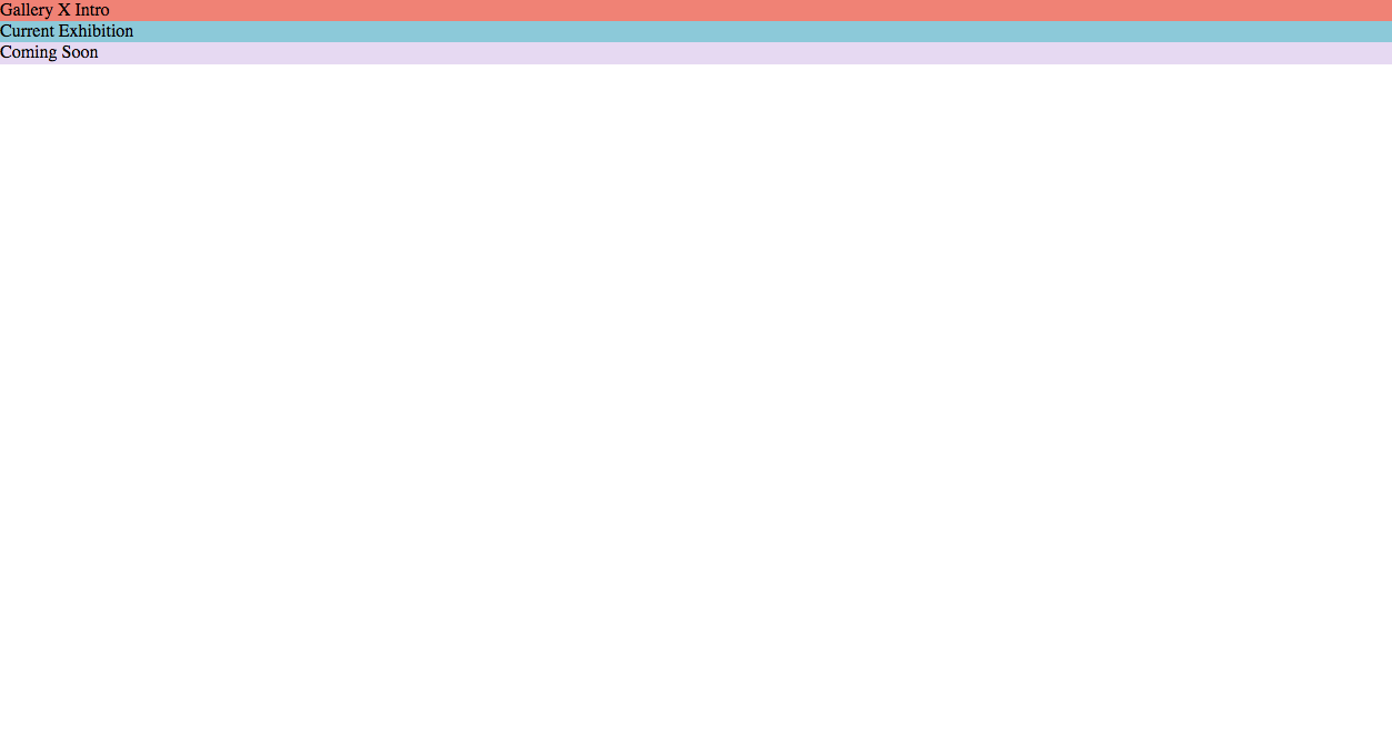
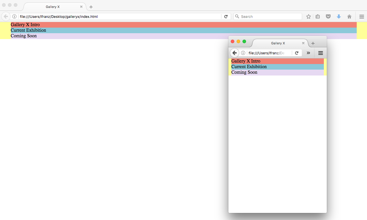
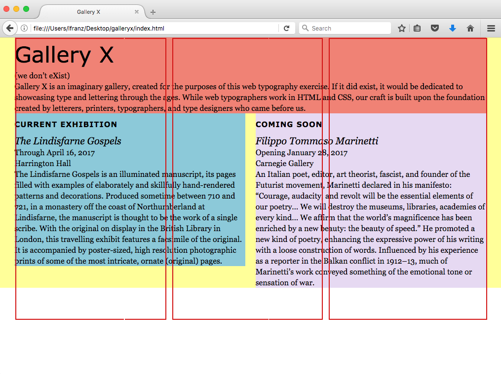
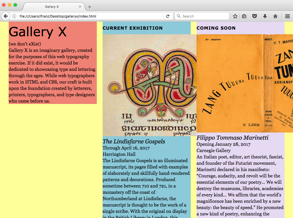
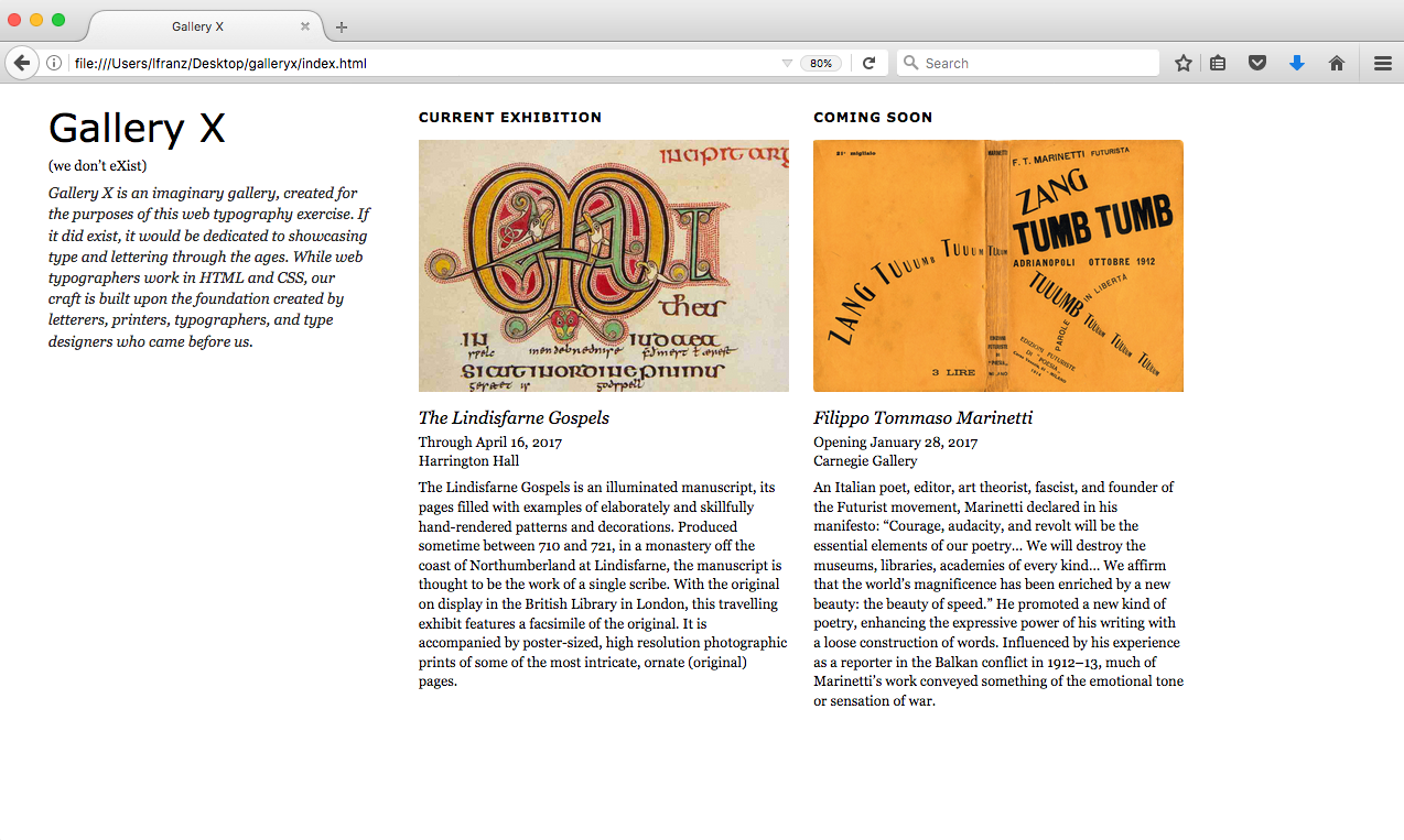
I’ve done the initial set up in the gallery_x HTML and CSS. I’ve included four divs: the main container, a Gallery X Introduction column, a Current Exhibition column, and a Coming Soon column. I’ve also put a word or two in each column and given them each a background name so you can see them in your browser. Spend some time reading my syntax to see how I’ve set things up.
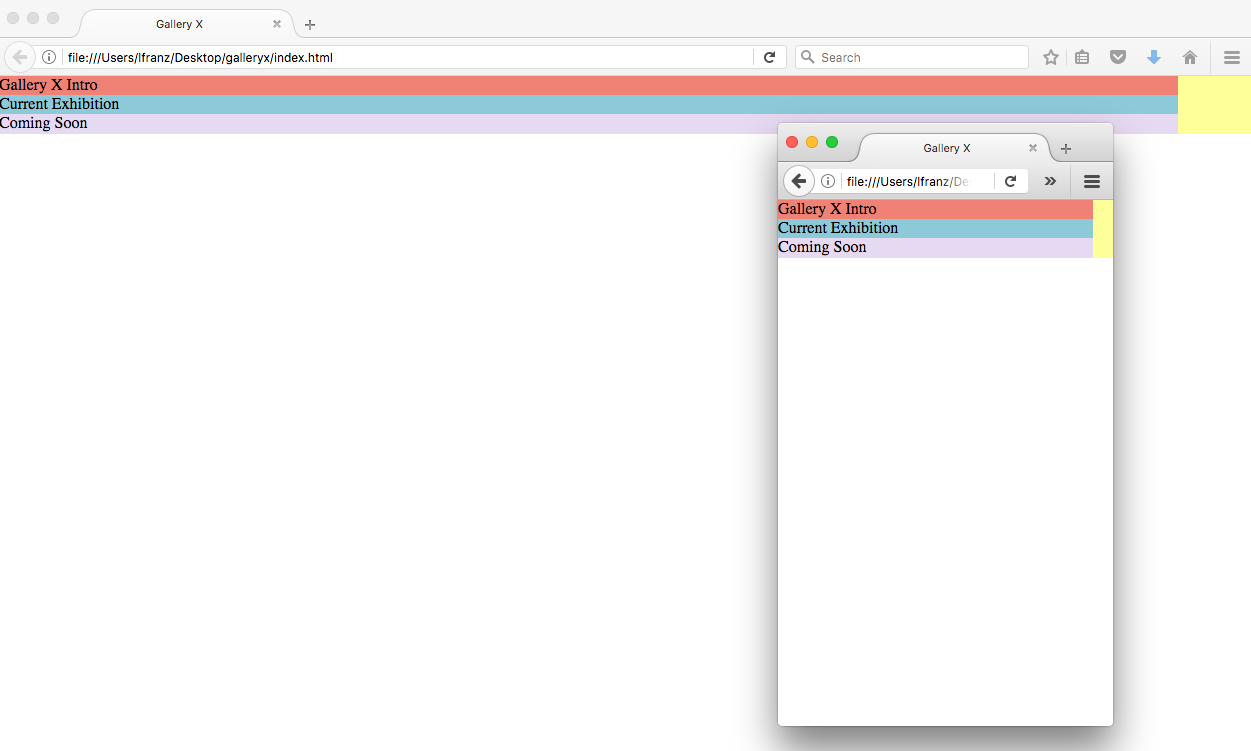
View the Page in Your Browser
You should see three stripes of color.
Start Your Responsive Layout
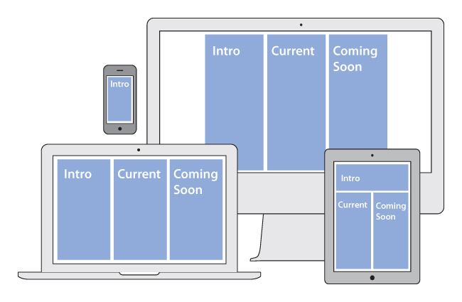
You already have four divs. The main container + three columns. The three columns will respond to browser size, moving around as needed, like this:
Style the divs in Your CSS File
To make your columns respond to the width of your browser, you need to stop setting widths in pixels and start setting them in percentages.The only div that will use pixels to set a max-width (e.g., the widest an element should ever get) is the main_container. Set the other divs to 94% width, like so (new syntax in bold):
#main_container{
  background-color:#FFFF99;
  max-width:1400px;
  }

#intro_column{
  background-color:#F08275;
  width:94%;
  }

#current_column{
  background-color:#8CC9D9;
  width:94%;
  }

#coming_soon_column{
  background-color:#E6D9F2;
  width:94%;
}
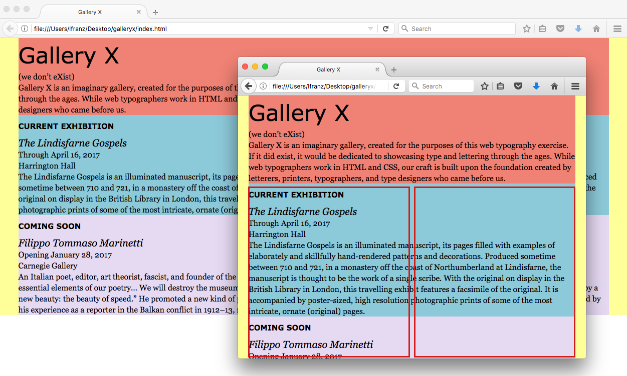
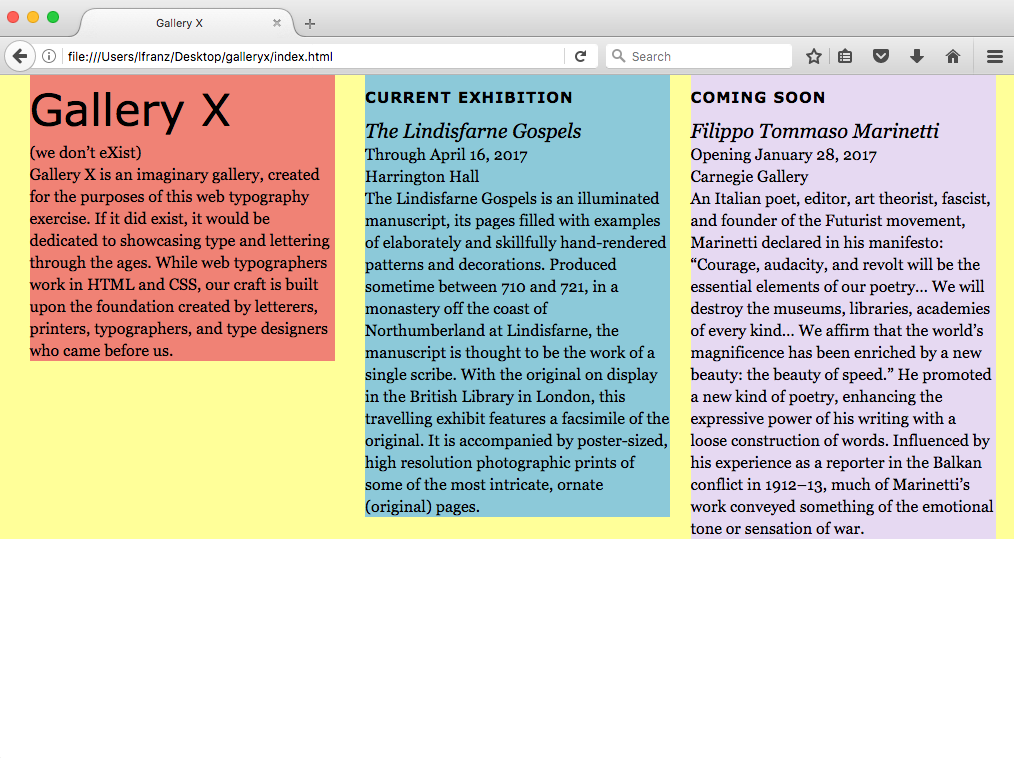
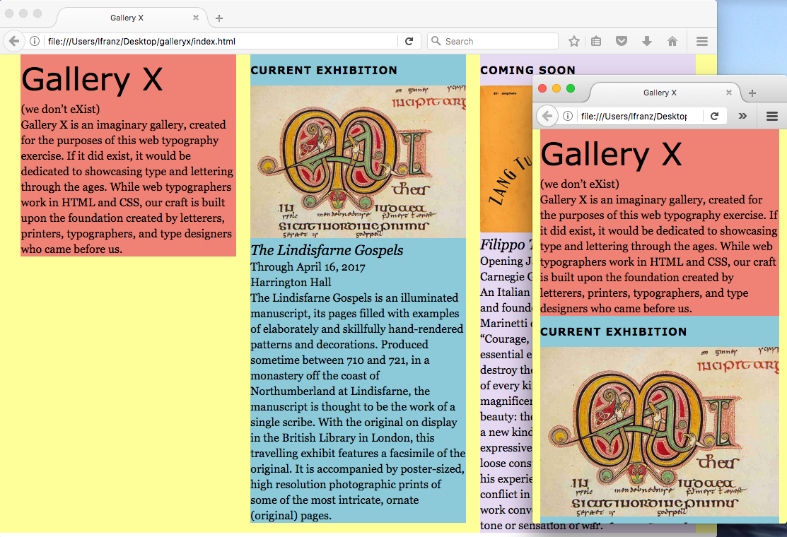
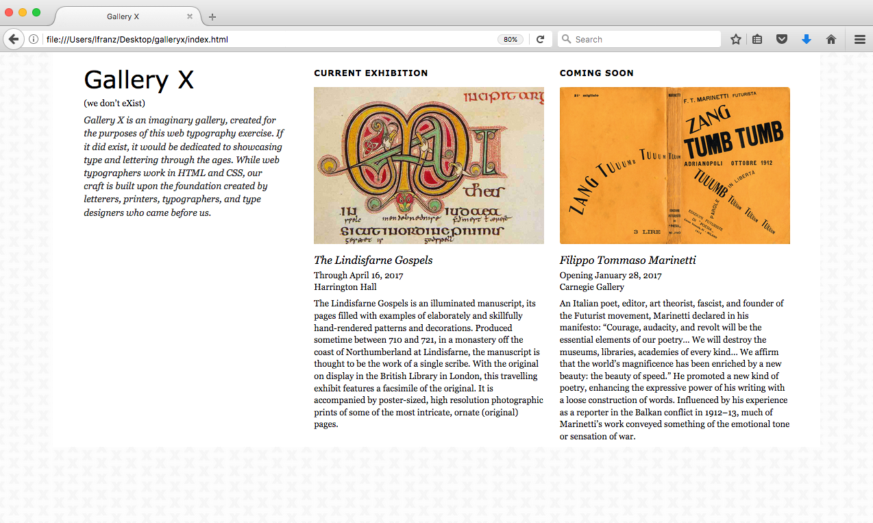
Save and View Your Page
You should now see the three divs, in a column, at the left edge of the page.
Narrow your browser window so it’s similar to the size of a phone or other handheld device. The main container responds to the size of the browser. And the three other divs react accordingly, remaining 94% the size of the main container.
Give the Mobile 1-Column Some Breathing Room
Add some left margin to move the text away from the edge of the browser.The three content divs each have a width of 94%. Give them each a margin-left of 3%, like so (new syntax in bold):
#main_container{
  background-color:#FFFF99;
  max-width:1400px;
  }

#intro_column{
  background-color:#F08275;
  width:94%;
  margin-left:3%;
  }

#current_column{
  background-color:#8CC9D9;
  width:94%;
  margin-left:3%;
  }

#coming_soon_column{
  background-color:#E6D9F2;
  width:94%;
  margin-left:3%;
}
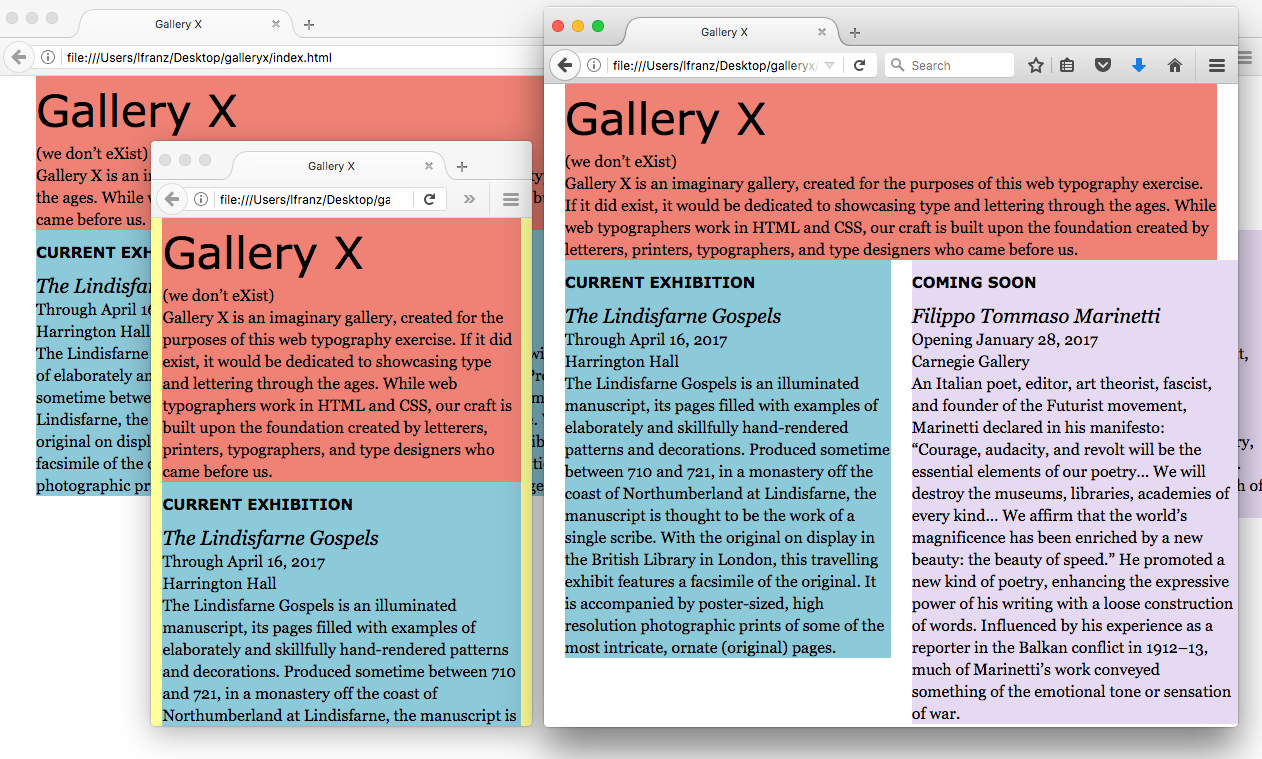
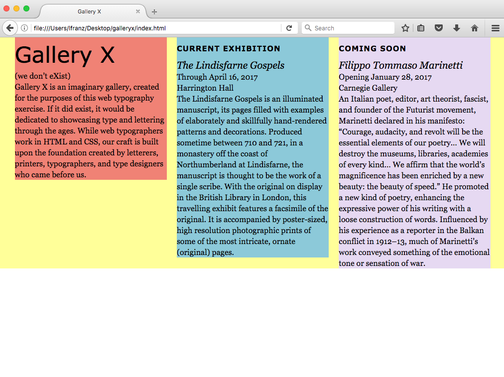
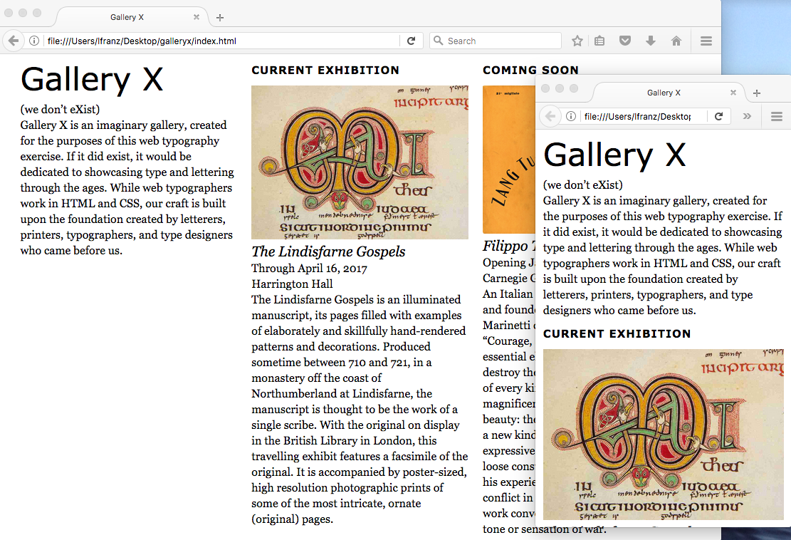
Save and View Your Page
You should now see the three divs, in a column, with an equal amount of space on either side.
The left and right margins now look equal. Even though I did not have you put any right margin on the divs. Why? Add the all the horizontal measurements you’ve specified on the three columns to see the answer.
Left margin (3%) + width (94%) = 97%.
That leaves a 3% “extra” space to the right of the divs. I always recommend leaving an “extra” space instead of setting both left and right margins. It keeps your layout flexible. Percentages are not the same as pixels and cannot be controlled with the same amount of precision.
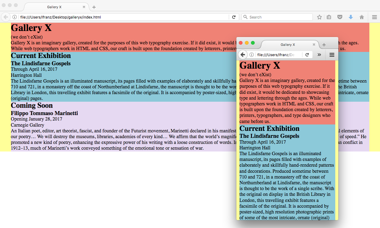
Add Content
Responsive layouts change when a layout breaks (no longer works). To determine that breakpoint, you need to add content.You have a basic mobile layout structure, you can now add content (.doc) into the divs. The word document tells you what content to put in each div.
A reminder: content goes in the HTML document. And each column is defined by a pair of div tags. Simply replace the words currently being used as placeholders.
Save and View Your Page
A single column will not work on every browser!

Define the Content
These next few steps are a repeat of previously used skills. Do them on your own.In the HTML:
- Make “Gallery X” your h1
- Make “Current Exhibition” and “Coming Soon” h2
- Make “The Lindisfarne Gospels” and “Filippo Tommaso Marinetti” h3
- Make the paragraphs of text and the dates/place info all p
Save and View Your Page
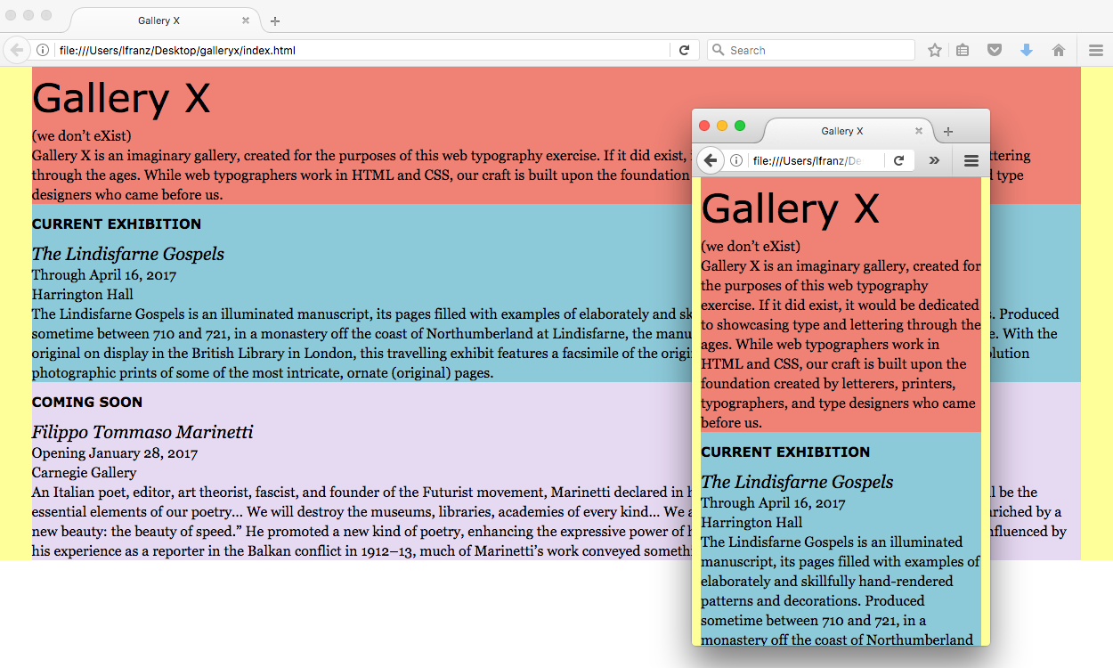
Style the Content
These next few steps are also a repeat of previously used skills. Do them on your own.In the CSS:
- Style your h1 the way you want it to look.
- Style your h2 the way you want it to look.
- Style your h3 the way you want it to look.
- style your p the way you want it to look.
For example, here’s how I styled my elements. (You can do them the same way, or you can do them differently if you want to!)
- My h1 is verdana, normal weight, 40px on 66px line-height.
- My h2 is verdana, bold, 15px on 44px line-height, all caps, with 1px letterspacing.
- My h3 is georgia, italic, normal weight, 20px on 24px line-height.
- My p is georgia, 16px on 22px line-height.
Save and View Your Page
Here’s how my type looks.
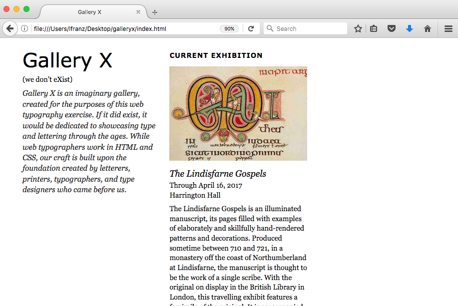
Create Your First Breakpoint
The 94% (plus left margin = 97%) wide columns are fine for a phone, but are too wide for a larger screen.
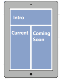
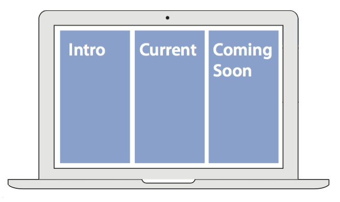
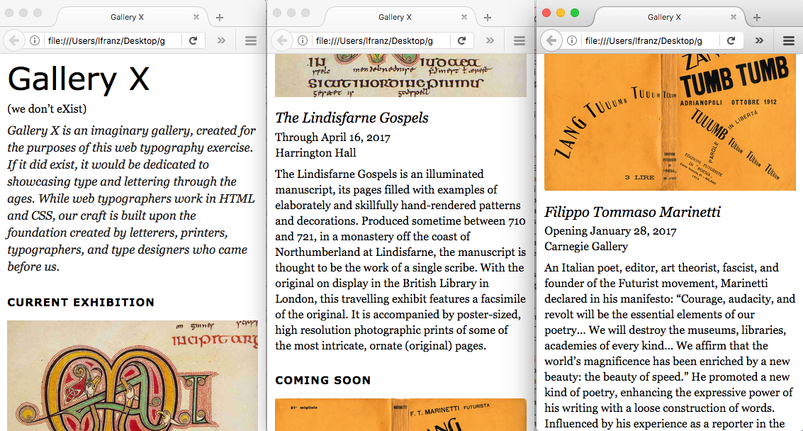
When the columns get too wide to comfortably read information, the layout should change. One option is to change the layout to a two-column page. Your layout will have the intro div along the top, with the Current Exhibition and Coming Soon columns side-by-side below it, like this:
Determine a Possible Breakpoint
It's hard to tell exactly where this layout change should happen. But you can estimate it.The next larger layout has two columns side-by-side. Estimate the point where you think two columns might work—not so narrow that two-columns get too narrow for the text, but not so wide that the Intro column is too wide.
Visualize a two-column layout. When the browser window seems about right, take a screenshot and measure the width of the browser. In this image, my browser is 690px. So I’m estimating my first breakpoint is at 690px.
Then take a screenshot of the browser window and measure the width. I’m going to set my first breakpoint at 690px. This is an estimate! I might need to change it later.
Add a Media Query in the CSS
Media queries basically tell the CSS: Pay attention to the media this page is being used on.You can use a media query to tell the CSS to notice the browser width.
At the bottom of the CSS file, type in the following syntax (I’m using 690px, if you’ve estimated a different width, use your measurement):
@media (min-width: 690px) {
 }
What does this mean? The syntax says, “pay attention to the media, if the width of the browser is equal to or more than 690px, do this.”
Except it doesn’t actually do anything yet. Because you haven’t told it what to do.
Tell the Media Query What To Do
What do you want the layout to do on browsers equal to or larger than 690px?You want to:
- Make the current_column and coming_soon_column turn into a two column layout.
Thus, the two elements you’ll be changing in the media query are the current_column and the coming_soon_column. Add those columns inside the media query like so (new syntax in bold):
@media (min-width: 690px) {
  #current_column{
        }

  #coming_soon_column{
        }
}
There are two closing curly brackets at the end. This is correct! One closes the coming_soon_column div, the other closes the media query.
Be Specific
Media queries over-ride earlier styling, so be specific about what you want the media query to change.In this instance, you want the width of the two columns to change. Since the single column is 94% wide, try changing the widths to half that width (new syntax in bold):
@media (min-width: 690px) {
  #current_column{
    width:47%;
    }

  #coming_soon_column{
    width:47%;
    }
}
This tells the CSS: if the browser window or device is wider than 690px, make the current_column and the coming_soon_column 47% the width of the main_container.
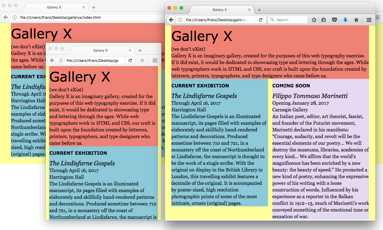
Save and View Your Page
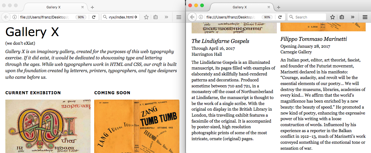
The current_column and the coming_soon_column are now narrower:

The two columns are narrower not just at the breakpoint, but on browsers larger than the breakpoint (the desktop view has also changed). Meanwhile, the phone view remains the same. This is good.
But there is a problem. The two columns should be side-by-side. They’re not.
Place the Columns Side-by-Side with the Float Property
As seen in the building blocks exercise, divs are block elements.By default, they show up as a single column of elements. In this layout, you want two columns to live side-by-side. To fix this, use the float property.
In the building blocks exercise, you learned that it’s best to float all the divs (so they recognize each other), and then clear the float when you want to create a new row of elements.
Do the same thing here. In your 690px media query, start by adding the Intro Column (it’s not changing size, but you want to float it). Then add the line float:left; to all three divs, like so (new syntax in bold):
@media (min-width: 690px) {
  #intro_column{
    float:left;
    }

  #current_column{
    width:47%;
    float:left;
    }

  #coming_soon_column{
    width:47%;
    float:left;
    }
}
Next — because this is the div you want to move down to the next row — add a clear:left; to the current_column. The clear must be before the float — after you clear the float:left relationship, you want to start a new one with the div that follows it. New syntax in bold:
@media (min-width: 690px) {
  #intro_column{
    float:left;
    }

  #current_column{
    width:47%;
    clear:left;
    float:left;
    }

  #coming_soon_column{
    width:47%;
    float:left;
    }
}
Save and View Your Page
When you added the floats, two problems emerged.
Problem 1: the main_container (yellow) no longer surrounds the column divs when the browser is bigger than 690px. As seen in the building blocks exercise, when an element inside another element is set to “float,” the element containing the floated element no longer recognizes it.
To fix this, add a main_container element in your 690px media query, and add the line overflow:hidden; (new sytax in bold):
@media (min-width: 690px) {
  #main_container{
    overflow:hidden;
    }

  #intro_column{
    float:left;
    }

  #current_column{
    width:47%;
    float:left;
    }

  #coming_soon_column{
    width:47%;
    float:left;
    }
}
As always, overflow:hidden; tells the main_container to look more carefully at what is inside it. To recognize the floated elements and open back up to include them.
Problem 2: the two columns take up too much room. That’s because the two columns, when added together, are wider than the Intro column.
The Intro column:
Left margin (3%) + width (94%) = 97%. Leaving 3% of space on the right.
The second row (of two columns side-by-side):
Left margin of Current column (3%) + width (47%) + left margin of Coming Soon column (3%) + width (47%) = 100%. Leaving no space open on the right.
It could be worse. If the total were greater than 100%, the Coming Soon column would have popped down to the next row (like the F block did in the building block exercise).
Solution: There is more than one way to fix this problem.
One idea: change the left margin on both of two columns to 2%. This will open up 2% of space (which will show up as extra space on the right).
Another idea: I prefer when the outside margins are a bit larger than the gutter (the margin between the two columns). Keep the left margin on the Current column at 3%. But change the left margin on the Coming Soon column to 2%. Then reduce the width of both columns by 1%. This opens up 3% of space (which will show up as extra space on the right).
@media (min-width: 690px) {
  #main_container{
    overflow:hidden;
    }

  #intro_column{
    float:left;
    }

  #current_column{
    width:46%;
    float:left;
    }

  #coming_soon_column{
    width:46%;
    margin-left:2%;
    float:left;
    }
}
Save and View Your Page
Everything works! I’m not happy with the ragged (right) edge of the text. Its too ragged in both columns. But for now the columns work. You can test the layout later and make subtle changes to improve the typography.
If you want to learn more about floats, Chris Coyner provides a simple, yet thorough explanation at All About Floats.
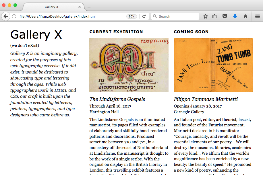
Create Your Second Breakpoint
For larger browsers, this design should have a three-column layout.
Determine a Possible Second Breakpoint
Again, it's hard to tell exactly where this layout change should happen. But you can estimate it.The largest layout has three columns side-by-side. Estimate the point where you think three columns might work—not so narrow that text won’t have enough room.
I’m going to set my next breakpoint at 1015px. This is an estimate. I might need to change it later.
Add Another Media Query in the CSS
Media queries must go from smallest to largest in the CSS file.In addition, they should be separate from each other. Make sure you do not put a media query inside another media query. At the bottom of the CSS file, add the larger media query (I’m using 935px, if you’ve estimated a different width, use your measurement):
@media (min-width: 1015px) {
 }
Tell the Media Query What To Do
What do you want to do on browsers equal to or wider than 1015px?You want to:
- Make all three columns, intro_column, current_column and coming_soon_column, turn into a three column layout.
To do this, you need to use a clear:none (to remove the clear:left) on the current_column, and change the width of all the columns so they fit on one row (new syntax in bold):
@media (min-width: 1015px) {
  #intro_column{
    width:30%;
    }

  #current_column{
    width:30%;
    clear:none;
    }

  #coming_soon_column{
    width:30%;
    }
}
Notice the syntax above is specific. Only add or change what needs to be added or changed. Do not repeat previous styling in multiple media queries.
Save and View Your Page
Everything works but the margins look a bit wonky.
Fix the Margins
Look at your margins and articulate what is wrong.The margin between the Intro column and the Current column is to wide. And the space on the right is too narrow.
I’m going to keep the 3% on the Intro column and a 2% on the other two columns. This will leave a remaining 3% of space on the right, and will balance everything out.
How can I fix this?
I go in to the 1015px Media Query in my CSS, leave the Intro column as is (it already has a 3% left margin), and change the Current column. I can leave the Coming Soon column alone, because it already has a 2% left margin. New syntax in bold:
@media (min-width: 1015px) {
  #intro_column{
    width:30%;
    }

  #current_column{
    width:30%;
    clear:none;
    margin-left: 2%;
    }

  #coming_soon_column{
    width:30%;
    }
}
Save and View Your Page
The margins are fixed.
There are still a lot of changes I’d like to make. But first I’ll put the images in so I have all the content in place.
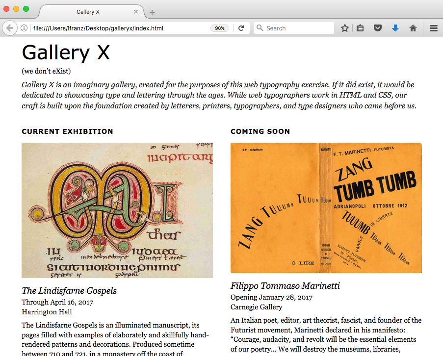
Add the Images (Content)
Two images belong in this web page. They are part of the content and will be added in the HTML page.
Get the Images
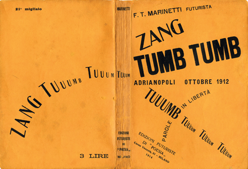
First, download the Lindisfarne Gospels image and the Filippo Tommaso Marinetti image.
Save the Images in an Images Folder
Inside the gallery_x folder, create an images folder. Save the two images there.
Add the Images in the HTML File
In this design, the images go just above the name of the exhibitions.Add them just before the names of the exhibitions in the HTML (new syntax in bold):
<h2>Current Exhibition</h2>
<img src="images/lindisfarne_gospels.jpg">
<h3>The Lindisfarne Gospels</h3>
...
<h2>Coming Soon</h2>
<img src="images/zang_tumb_tumb.png">
<h3>Filippo Tommaso Marinetti</h3>
What does this mean? img src= means insert the following image source. “images/lindisfarne_gospels.jpg” means use the file called lindisfarne_gospels.jpg inside the folder called images. (Whenever you use a slash, you’re telling the browser to go inside a folder.)
Save and View Your Page
Well that’s not right!
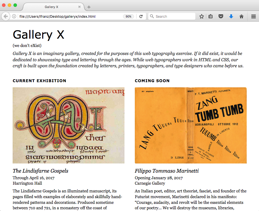
The images are way too big, and break out of their divs! Why? Because the images have been placed at their full size into a responsive layout.
Make the Images Responsive
There is more than one way to make an image responsive.For this exercise, you will use the quickest, easiest method. This is not always the best approach, because it loads large images (and larger amounts of data) then shrinks the images down to size as needed. This can cause web pages to load more slowly on phones.
But it is the easiest way to do it, and this exercise covers a lot. So you’ll start with this method.
In the CSS file, add the following syntax so it works at all sizes. To make it work at all sizes, put the syntax before the first media query. All wider browsers will continue to use the styling — unless you tell them otherwise.
img{
    width:100%;
    }
What does this mean? img means “style all images this way.” width:100%; means “make the width 100% of the width of the space available in the div.”
Save and View Your Page
The images now fit properly in the columns.
Ack. It’s time to get rid of those background colors. Then move on to look closely at each layout and make changes as needed.
Remove the Background Colors
They were helpful when setting up the page structure, but now they make it difficult to look closely at the type and images.Change the background color of all four divs to white (#FFFFFF). As always, to make the background color work at all sizes, put the syntax before the first media query.
When you’re done, your page should look something like this. If it doesn’t, try changing the background colors again.
Look Closely at the Mobile View
What Do You Need to Fix?
There are some problems that need to be fixed.
- The text all runs together. Some space between paragraphs would help.
- The name of the exhibitions needs some space too. It would have more emphasis if it wasn’t crammed in between the image and the date.
- There isn’t enough space above the section headings “Current Exhibition” and “Coming Soon” so the new sections don’t stand out as much as they could.
- I think the intro paragraph should look different from the other text.
- The narrow column width is creating a terrible ragged edge on the text about the Lindisfarne Gospels.
Add Space Between Paragraphs
You've done this before in earlier exercises.I recommend adding a margin-bottom on the p in the mobile view (e.g., before the first media query) section of your CSS. I added 8px of space to mine
Add Space Around the Exhibition Names (h3)
You can add space around a text element one of two ways: increasing the line-height, or adding margin/padding above and below.Increasing the line-height adds equal amount of space above and below the element. I think the h3 needs a bit more space above it than below it. I recommend using a margin-top and margin-bottom instead of adding line-height. Again, make the changes to your h3 in the mobile view section of your CSS.
I added 12px above and 4px below my h3.
Add Space Above the Section Headings (h2)
This is a similar problem to the one you fixed in the h3.In fact, I find adding a generous space above and a small space below the h2 really helps it stand out. Again, use margin-top and margin-bottom. And make the changes in the mobile view section of your CSS.
I used 16px above and 4px below my h2.
Make the Intro Paragraph Look Different
You used a .intro class already in the bibliography exercise.Use it again here, on your own. Again, put any styling of the .intro class in the mobile view section of your CSS.
I made my intro paragraph 17px on 24px line-height, italic, dark gray.
Adjust Columns to Fix Ragged Edge (or Not)
There are some very ragged edge in the text. This happens when a column is too narrow for the text inside it.One solution would be to make the column a little bigger. But you don’t have a lot of wiggle room here. The divs already take up 94% of the width of the screen.
Another option would be to make the text 1px smaller. But you don’t want to compromise legibility.
For now, I recommend leaving the ragged edges. You haven’t seen the page on an actual phone yet. You’re probably on a desk top or laptop. Since this is a one-page exercise, finish the page, then test it on a couple of phones and tablets to see if you need to make any final tweaks to column widths or text size.
Note: if you face a choice between readability and a ragged edge, always choose readability.
Save and View Your Page
For the most part, the vertical spacing is better.Elements that should be emphasized are emphasized. There is a new problem though…

The date and place for the exhibitions feel too far away from each other. In fact, the place (Harrington Hall) is floating all by itself.
Use the Break (br) Tag
When two or more lines of text belong together (e.g., lines of a poem, lines of an address) but need to break in a specific place, you can use the break tag.Break tags should be used sparingly, only when the break is meaningful, and never to fix a ragged edge of text.
When using the break tag, the two lines need to be in the same paragraph, like this:
<p>Through April 16, 2017<br></p><p>Harrington Hall</p>
Save and View Your Page
The date and place are clustered together now. It’s a much better space relationship.
The mobile layout of the page it done. But you’ve made a lot of changes. It’s time to see how those changes effected the two- and three-column layouts.
Look Closely at the Two-Column Layout
What Do You Need to Fix?
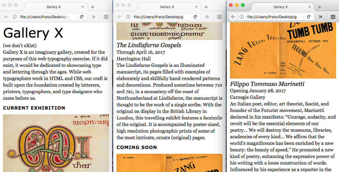
The two-column layout covers a wide range of widths. From the narrowest view…
To the widest view (just before it turns into a three column layout)…

There are two problems that need to be fixed.
- The amount of space between the columns feels a little tight. There should be a bit more separation.
- The two images are slightly different heights, which makes it look like one of the columns is “wrong.” If the two images were very different, it would not be a problem. But the slight difference looks like a mistake.
Figure Out the New Space Between the Columns (Math!)
When setting up the structure, the columns used to have a background color. This made the space between them stand out.When you removed the background colors, the space visually receded. Now the columns are a little too close together.
At the first breakpoint (inside the 690px media query), add space between the columns by increasing the amount of left margin on the Coming Soon column (the center space — the gutter — is controlled by the left margin on the right column.)
But wait. What seems like a simple fix will have repercussions.
Increasing the inside margin-left will affect the width of the “leftover space” creating the far right visual margin… This could be fixed by reducing the width of both the Current Exhibition column and the Coming Soon Column… But then the combined width of those two columns won’t match the Intro column anymore…
Here’s an image to show what I mean. Note where subtle changes need to be made in order to keep the layout I’ve assigned in this exercise:
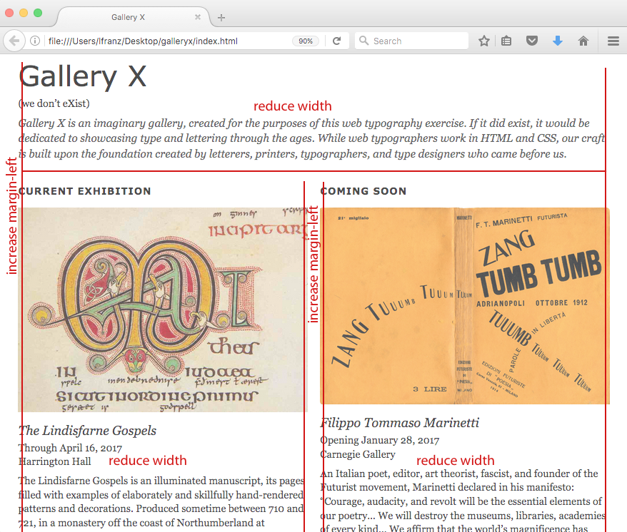
If you change the inside margin (gutter), you should increase the outside margins too. Which means you need to reduce the width of the two lower columns. And you need to reduce the width of the Intro column up top. A simple change starts getting complicated.
Fixing the space between the two columns takes a little math.
- The total of all margins and columns in a row must = 100%
- If you want the two columns equal width, their sum must be an even number (e.g., 90%)
- In order for the total width of the two columns to be even, the sum of the margins in a row must be even.
The image below shows the changes I’ve decided to make to my margins and widths. New measurements are in red.
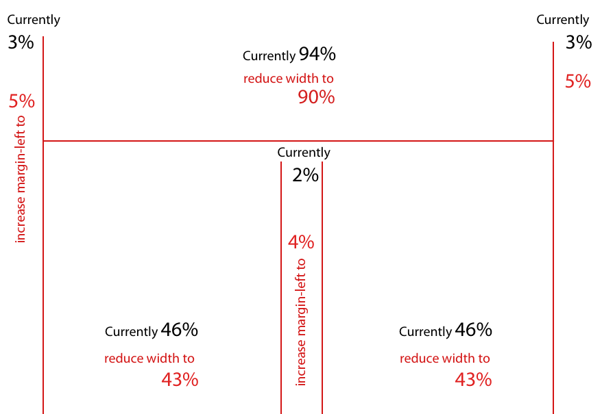
Notice that if you add the measurements across the top row (the Intro column): 5+90+5 (leftover) = 100%. If you add the measurements across the bottom row (Current Exhibition and Coming Soon columns): 5+43+4+43+5 (leftover) = 100%. These measurements will (theoretically) work.
Change the Space Between the Columns
This change occurs in the two-column layout.So make the changes at the two column breakpoint… inside the 690px media query. There are a lot of little changes to be made. When this happens, the changes can start to feel overwhelming. I recommend breaking the changes down into a list of steps. For example:
- Change the margin-left on the intro_column to 5%
- Change the width of the intro_column to 90%
- Change the margin-left on the current_column to 5%
- Change the width of the current_column to 43%
- Change the margin-left on the coming_soon_column to 4%
- Change the width of the coming_soon column to 43%
These are all very simple changes. Writing them out and checking them off as you go will help you stay focused on the task.
Save and View Your Page
The amount of space between the columns is good. The two exhibitions are more separate from each other.
Fix the Image(s)
The Lindisfarne Gospels image has a slightly different width:height ratio than the Marinetti image.This makes the image look slightly taller in the web page. To fix this, I recommend either changing one of the images so their width:height ratio is equal, or changing one (or both) of the images so their width:height ratio is more radically different.
Since the Lindisfarne Gospels image is already cropped. I recommend changing that image to match the width:height ratio of the Marinetti image.
There are different ways to make sure the two images have the same width:height ratio. This is how I fixed my Lindisfarne Gospels image:
- I made a copy of the Lindisfarne image, and worked on the original version.
- I opened both the Lindisfarne and Marinetti images.
- Using the Marinetti image, I tested various crop-tool ratio settings until the setting matched the Marinetti image.
- I used the crop-tool with the same ratio setting to crop the Lindisfarne image.
- I saved the Lindisfarne image. Since I didn’t change the name of the image, the newly cropped image automatically loaded when I refreshed the page.
Save and View Your Page
Once you’ve fixed your Lindisfarne image and finessed the typography to your liking (I personally ended up adding a little margin top to the Intro column), it’s time to move on to the three-column layout.
Look Closely at the Three-Column Layout
What Do You Need to Fix?
There are two problems that need to be fixed.
- The three columns no longer fit in one row.
- The spacing between the Intro column and the Current column looks tight compared to the far left margin — between the Intro column and the edge of the browser — which looks a little loose.
Once you can see all three columns on the page, you might find other things you’d like to change.
Get All Three Columns in the Row
The total widths of the left margins and the columns must equal more than 100%.At this breakpoint (the 1015px media query), you have the following measurements:
- Intro column margin-left: unspecified, width: 30%
- Current column margin-left: 2%, width: 30%
- Coming Soon column margin-left: unspecified, width: 30%
The unspecified measurements were set earlier in the CSS. They are probably being picked up from the first breakpoint (at the 690px media query):
- Intro column margin-left: 5%
- Coming Soon column margin-left: 4%
Now add those measurements together:
5% + 30% + 2% + 30% + 4% + 30% = 101% (with no space left over to create the right margin).
The challenge: Reset the margin-lefts and widths of the three columns (as needed) here in the second breakpoint (the 1015px media query). I personally found the intro column could be narrower in this layout, and ended up with the following measurements:
- Intro column margin-left: 4%, width: 26%
- Current column margin-left: 4%, width: 30%
- Coming Soon column margin-left: 2%, width: 30%
- Which left 4% left over for the right margin space
Save and View Your Page
Feel free to experiment with various margins and widths at this third breakpoint. Your measurements to not have to be exactly the same as mine.
Look at the Three-Column Layout on a Large Screen
What Do You Need to Fix?
There are two things we can fix.
- I prefer the main_container centered in the width of a large browser.
- A background image in the space framing the main container will help define the “page.”
Center the main_container
You've centered a main_container before (for words and the first bibliography).Honestly, centering the main container probably won’t affect any of the other layouts, so you could do it from the beginning if you wanted to, but theoretically, since we’re styling the largest layout, you should do it down at your final breakpoint (inside your 1015px media query). I’ll leave the decision up to you.
If you can’t remember how to do it, refer to the CSS cheat sheet (2017)!
Add an Image in the Background
The two images you've already added (Lindisfarne and Marinetti) are content.You added them in the HTML. A background image is decoration, and is added in the CSS.
You can add a background image to any element. To put one in the background of the entire page, you add it to the body.
- Download this background image, and put it in your “images” folder,
- Then, in your CSS document, add the following syntax (new syntax in bold):
@media (min-width: 1015px){

body{
   background-image: url(images/x-gray.png);
    }
Save and View Your Page
By default, the image repeats across and down the page, creating a background texture. You can control images and how they behave. HTML Dog’s CSS reference has a page about backgrounds, and Chris Coyier at CSS Tricks also explains more about backgrounds.
Fix a Previously Unseen Problem
When I put the background image in, I noticed the main container is too tight to the end of the Coming Soon column.This can be fixed in one of three ways:
- Think of the fix as adding more space inside the Coming Soon column (add padding-bottom to the Coming Soon column)
- Think of the fix as adding more space after the Coming Soon column (add margin-bottom to the Coming Soon column)
- Think of the fix as adding more space inside the bottom edge of the main container (add padding-bottom to the main container).
In this situation, any of these ideas are correct, and none are wrong. Pick which one you prefer and fix the spacing between the bottom of the Coming Soon column and the main container. There is also a good chance the problem is happening all along. Look at all three layouts. It might make the most sense to make the change in the mobile view!
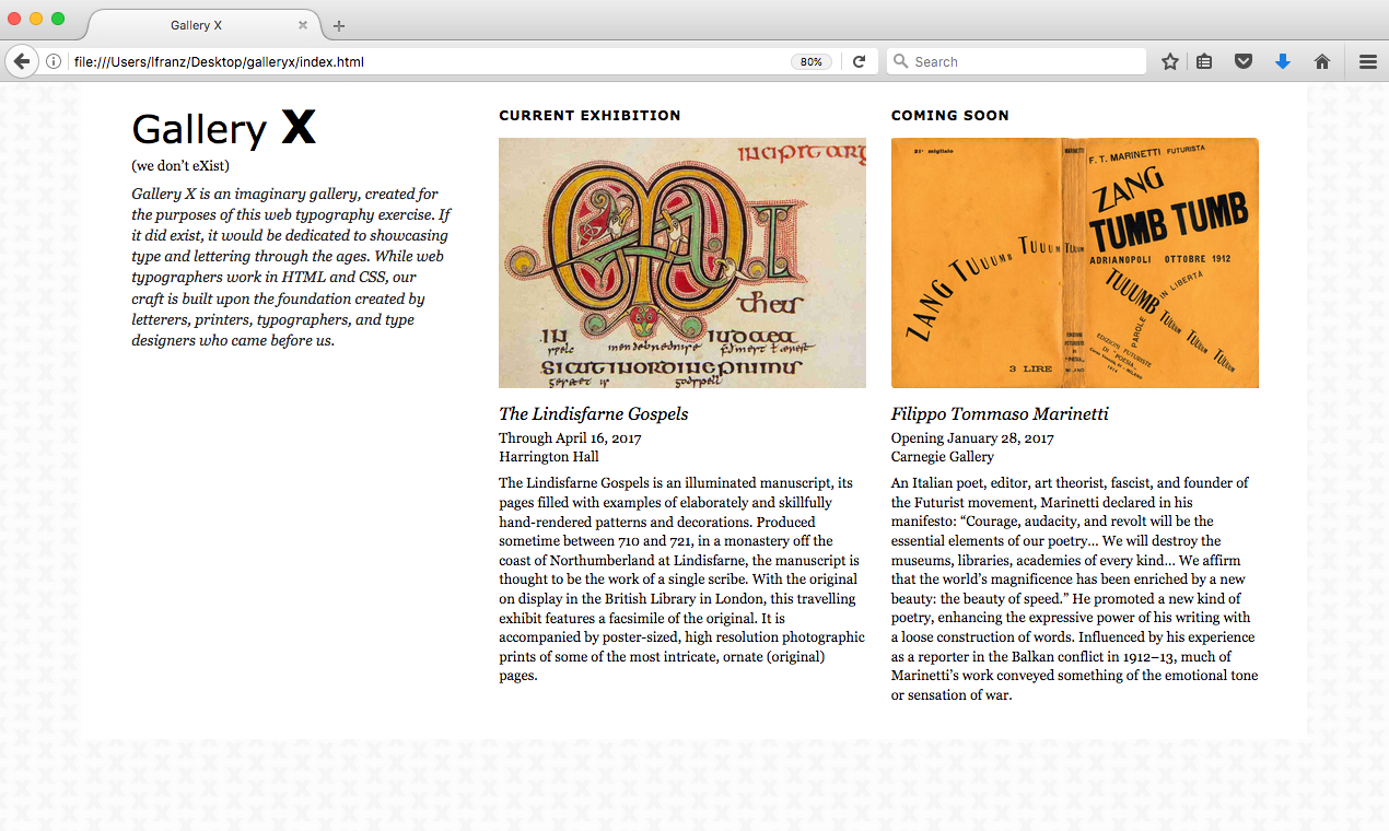
Make the X Look Different from “Gallery”
Now that the structure is responsive, it’s time to make one last change. Make the X stand out by making it bold. One way you could do this is to use the <strong></strong> tags. But sometimes you’re using <strong></strong> for another purpose.
Another method is to create and apply a class.You used a class earlier, but applied it to an entire paragraph. It is also possible to apply a class to a specific sentence, word, or letter using the <span></span> tag.
Here’s what the HTML looks like (new syntax in bold):
<h1>Gallery <span class="x">X</span></h1>
Basically, you add the <span></span> tags around the element(s) you want to style, then add the class to the opening <span> tag (the same way you added it to the <p> tag for the intro paragraph).
The CSS works the same as the other classes you’ve created:
.x{
   font-weight:bold;
   font-size: 48px;
   }
Only specify what you’re changing about the element. For example, my “X” is bold and 8px bigger than the rest of the h1. So I only set the weight and size.
Note: You want the class to work on all three layouts. So add it to the mobile view section of the CSS at the top of the page.
Save and View Your Page
You’re almost done! You just need to take care of some behind-the-scenes tasks.
Make it Work Cross Browser
You can’t tell by looking at the responsive screen on your laptop, but this is not going to work on an iPhone. Not yet anyway.
Tell Devices to Look at their Viewport Size
Some mobile devices will show a web page at its largest size regardless of media queries.Why? Since many sites are not yet optimized for mobile, some modern mobile browsers are purposely set to a larger viewport — meaning they act as if their browser is larger than it actually is. This way, readers see the entire page (just really small) and can pinch-to-zoom to see the content they want to read. Theoretically, this is better than only seeing a portion of a web page when it loads.
Since your responsive layout is optimized for mobile browsers, you can use the viewport meta tag to tell browsers to use their real device width for the viewport.
Put the viewport meta tag into the head of your HTML document. If you are using Google fonts, make sure your Google font link remains first in the head element. To keep things clean, I like to put my meta tags near each other. My syntax looks like this:
<head>
 <meta charset="utf-8">
 <meta name="viewport" content="width=device-width">
 <title>Gallery X</title>
 <link href="gallery_x.css" rel="stylesheet" type="text/css">
 </head>
Add respond.min.js for older IE browsers
Respond.min.js is a script that doesn’t take long to load, and is written to fix a very specific problem: it translates min-width and max-width media queries and all media types to non-supporting browsers.In other words, if a browser doesn’t understand what a media query is, respond.min.js explains it.
The suffix (js) means the script is written in javascript. You don’t need to know how to write javascript, you only need to know how to use specific (respected, bug-free) scripts that have been written by others.
To add respond.min.js to your page…
- Go to https://github.com/scottjehl/Respond
- Click “clone or download” button
- Choose to download the zip file
- Unarchive the zip file on your computer
- Inside your gallery_x folder, create a folder called scripts
- Put the file “respond.min.js” in the scripts folder (it may have to look for it, it’s there)
- Add the following syntax in the head of your HTML document immediately after your link to your CSS file. (Scripts should go after stylesheets in your head.)
<head>
 <meta charset="utf-8">
 <meta name="viewport" content="width=device-width">
 <title>Gallery X</title>
 <link href="gallery_x.css" rel="stylesheet" type="text/css">
 <!--[if lt IE 9]>
 <script type="text/javascript" src="scripts/respond.min.js">
 </script>
 <![endif]-->
 </head>
What does this mean?
The first line is a conditional comment. Only Internet Explorer pays attention to conditional comments. This one says: if the browser is less than IE9.
The second line “calls for” or “links to” the script. It says: find the javascript file named respond-min.js in the scripts folder, and use it. By including scripts/ in the source file path (src), the browser knows to “look” in the scripts folder for the .js file.
The last line ends the conditional comment.
That’s it.
Notes on Media Queries
Media queries can be used to change images, color, spacing, fonts, and so on.They can get pretty complex. You can have multiple queries that fix problems at multiple breakpoints.
Someday, when you have multiple media queries, you can put each one in its own CSS file and link to multiple CSS files. For now, there’s no need to do that, just keep your media queries in your main CSS file. Always work from smallest (mobile, no need to use that @media syntax) to largest. That way, media queries will correctly over-write the elements you want to over-write.
The number one thing to remember about media queries is that they don’t have to query a specific kind of device. Don’t worry about targeting phones, tablets, and certain laptops. The best way to use media queries is to target breakpoints in a design. If the design shifts when it needs to, it will work at all browser sizes.
Notes on Pixels Instead of ems
The trick to creating a responsive grid is using responsive measurements for the horizontal widths in your layout.Percentages are responsive, and will give you the flexibility you need for your column widths.
Because readers scroll through content, vertical measurements don’t always require the same level of responsiveness. Text can change as needed at the break-points, and doesn’t have to be responsive either. Thus, wherever you don’t need to use percentages, you’ll use pixels in the lessons for this book.
Some web designers use ems instead of pixels. If you are not familiar with what an em is in web design, an em is a unit of measurement usually equal to the base size of the text (the default base size is 16px).
Working with ems can be a good thing. They allow a design to remain consistent even if a reader chooses a larger base-size for their text. Working with ems is also complex. For creatures with 10 fingers, thinking in base-16 is a mathematical challenge. In addition, due to the “cascading” nature of CSS, the base measurement of an em isn’t always 16px; it changes based on font-sizes used within a layout.
So using ems correctly means understanding child relationships in CSS. And if you’re just learning how to think like a typographer in CSS, you don’t need to be learning the basics… while wrapping your head around an intermediate to advanced understanding of the CSS system… while doing a lot of division.
So in this book, you’ll use pixels and percentages. Later, if you want to learn how to use ems, you’ll have a solid foundation on which to build your knowledge.
Recommended Resources
- To learn more about adaptive, fluid, and responsive grids, visit liquidapsive.com
- To get respond.js and read instructions, visit https://github.com/scottjehl/Respond
- To learn more about background images, try http://www.htmldog.com/references/css/properties/background/ or https://css-tricks.com/almanac/properties/b/background-image/
- As always, feel free to download and use the CSS cheat sheet (2017).