Overview of the Assignment
In this lesson, you redesign Jamie Peterson’s resume using a Modernist approach.
This lesson focuses on creating a complex structure using multiple divs and naming them with classes. Other aspects of the lesson are glossed over, because you’ve done them in earlier lessons. Your challenge is to think about how to do things I previously covered on your own, versus following instructions step-by-step.
Practice the process of
- looking at the page in a browser and identifying a problem (what is the thing I want to change?) — e.g., “my main headline is over to the right too far.”
- articulate your theories about what might be causing the problem… or even just what element the problem might be related to — e.g., “I want less space to the left of my headline. My headline is my h1. The h1 is in the header. The header is in the main container. I might have left margin or padding (or both) on my h1 I need to change. And/Or I might have left margin or padding (or both) on my header I need to change. If the problem is on my main container, then way doesn’t everything along the left edge of my page have too much left space? Or does it?”
- Look at your CSS, find the things (h1, header, main container) you think might be the problem. When you find the problem, fix it. If you can’t find the problem (for something complex) try googling the problem.
Don’t worry if you’re still going back to the original instructions and doing some step-by-step copying… learning a new skill takes time. Be patient and try it on your own first. You might be surprised how much you know.
Overview of the Lesson
- Choose a sans serif typeface with all the elements you need (a bold, an italic, pleasing numbers, and pleasing caps if you use them).
- Make a copy of the resume_details folder. Rename it resume_modern. Rename your CSS file resume_modernist.css, and link to it.
- Test the new font (to make sure it works cross-browser). Work from this chart of OS/Browser combinations to test while testing the font.
- Follow the walk-through provided. Read what a typographer looks for in the process.
Getting Started
Create the Lesson Folder
In this exercise, you’ll once again modify the resume you set up in the resume details lesson, so make a copy of the resume_details folder and name the new folder resume_modern. Keep it in the web_typography folder.
Set Up Your Files
Rename the CSS file resume_modern.css. Link it to the index.html file. Change the title to Modernist Resume.
Choose a Sans Serif Font
The Modernist page uses sans serif typefaces, and creates stronger emphasis with size and weight (bold). As contemporary web typographers, we can mix and match fonts and styles. But for this lesson, start with a sans serif font.
I found my font, Open Sans at Google Web Fonts. If you need a refresher on finding a Google Font, see the Classical Resume exercise.
Use the New Font
Use the new font in your Modernist resume. If you can’t remember how to use a web font, revisit the appropriate exercise: either @font-face Bibliography or Google Fonts Bibliography .
If you’re using a Google Web Font, make sure you use the conditional comment method for IE8 and lower. If you don’t remember how to do this, revisit the Classical Resume exercise.
Update Styling in the CSS
Once the new font is in use, make changes as needed just like you did for the Classical resume. For example, traditionally the Modernist page used bold to create emphasis. It also used italic for subtle emphasis, but was less likely to use capitalized headers.
Make just enough changes to get a sense of how the type could work on the screen. Don’t worry about the details yet, since you need to test the font cross browser to make sure it works.
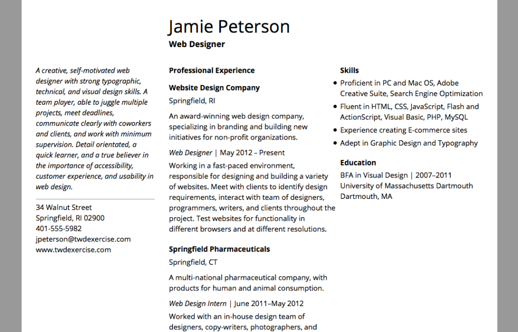
Apply your new Sans Serif font. Make sure your font size and line height are appropriate for the font, and you’re using bold, italic, and normal weights and styles as needed.
Test the Font Cross Browser
Follow the same procedure you used in the Classical Resume exercise to test your font cross browser. Here’s a copy of the chart of OS/Browser combinations to test. As always, keep a folder of your testing screenshots to refer to later.
Design The Modernist Page
I’ve decided to use Open Sans. I didn’t have to test it, since it’s a font I’ve tested previously and I know it works well. (Another good reason to keep your screenshots!)
Start a Mock-Up
Use one of the empty mock-up_templates if you find they work for you.
Get the Fonts for the Mock-Up
If you don’t know how to do this, see the Classical Resume exercise for my notes on getting fonts for the mock-up.
Be Inspired by the Modernist Page
The Modernist page tended to use a grid to create architectural space (instead of use space as a frame around the text). It used strong contrasts to create emphasis (particularly size, weight, and space), and asymmetry to guide the reader’s eye. It had rhythm and clarity.
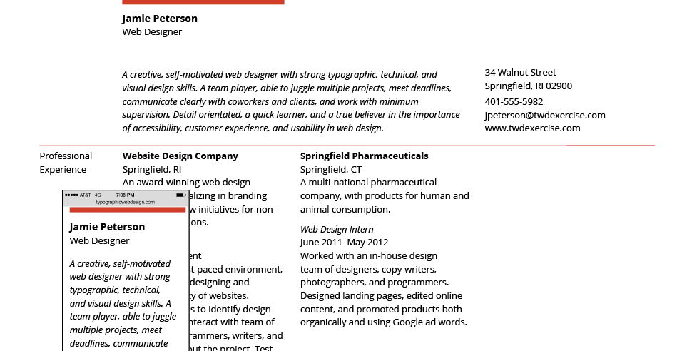
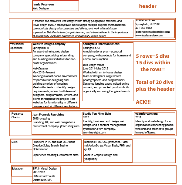
My Modernist page mock-up. On large browsers, it uses multiple rows with four columns each. On mobile browsers, it will need to be reduced to a single column… with everything in the correct order!
Change the Structure
In the last lesson, I had you start with the mobile typography, working your way up to the structure. Since the modernist page is more architectural in structure, it makes sense to start with the structure and work your way down to the text.
Identify How Your Structure Will Change Between Big and Small Browsers
You need to build a structure that works across various browser sizes. Take a moment and sketch out how the elements need relate to each other when they move into a single-column mobile layout.
Look for a pattern. For example, in my sketch, I see that if I build my page as a series of rows, the elements can fall into place without having to use the display property to show/hide any elements.
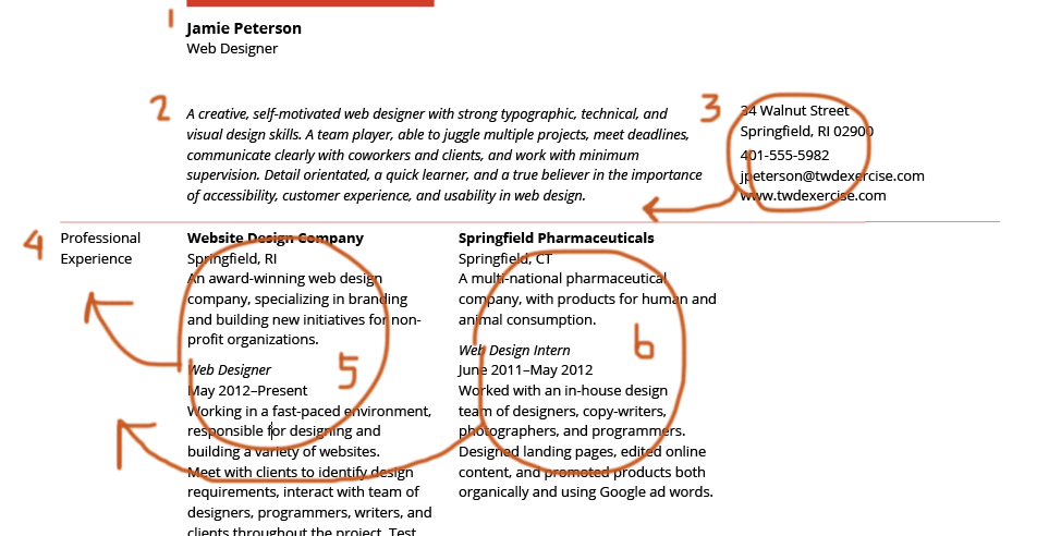
My Classical page had two columns. My Modernist page has four columns. But when building it, I need to think of it as a series of “rows” with up to four column in each row.
Identify the Divs You Need
This layout requires multiple rows, and each row with multiple columns in it. To build this, I need to create a structure of divs withing divs. My layout will require 20 divs. Not including the header or the main container.
Learn to Love Classes
IDs cannot be used more than once in a page. Twenty structural divs could mean a lot of syntax. Every <div id=”nameofdiv”></div> would require coming up with a suitable name plus styling the div in the CSS. Ouch.
But I don’t have to use IDs to style divs. I can use classes instead!
Classes can be used more than once in a page. I can find repeating patterns in the layout, and create a specific class for each “kind” of div I need to use. This results in needing only 5 classes for my divs: .row, .content-column, .double-column, .narrow-column, and .cat-column.
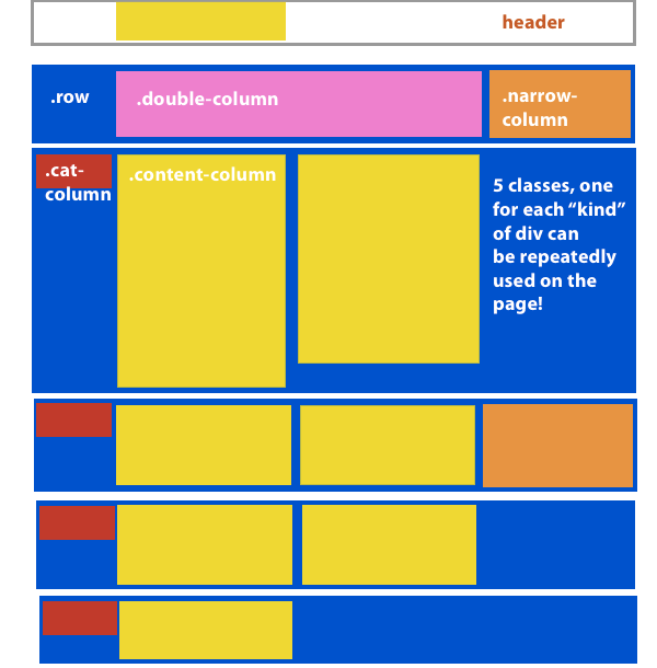
When I looked for pattern in my structure, I realized I only have 5 “kinds” of divs that can be used repeatedly throughout the page. So I need to make 5 classes.
Build the New Structure
This next part takes patience and attention to details. Here is how I recommend handling it.
First, Remove the Old Column Containers
In the HTML, remove all of the column container div tags from around the content. Why? Because it’s easy to get confused with all the extra <div></div> tags. To be clear, don’t delete the content, just the div tags.
In the CSS, remove all the column container styling. That is, remove #skills_column, #content_column, #experience_column, and any others you might have added to the structure. Delete the styling at the top and in the media queries. Why? It’s less syntax to look at and be confused by. It also keeps your CSS clean.
Next, Create and Add the Rows
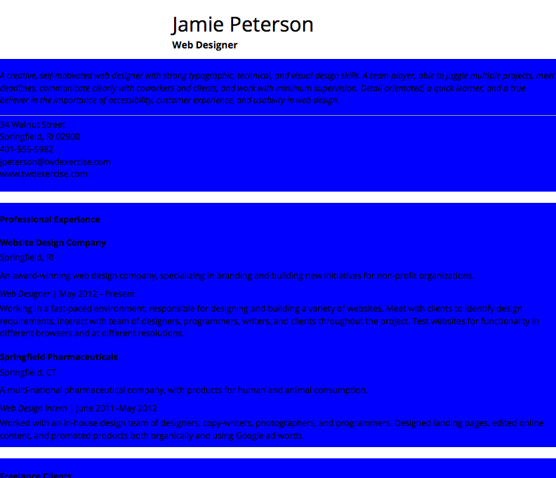
In the CSS, create a class for the rows. I made mine blue, 100% width, and gave it a bottom margin of 22px. (I need a space between them, and the line-height on my text is 22px).
Try to write that syntax on your own. Mine looks like this:
.row{
   width:100%;
   background-color:blue;
   margin-bottom:20px;
   }
Add the rows into the HTML, wrapping all the information you intend to “live” in a row with the <div class=”row”></div> tags. For example, I have five rows in my layout, so I used the div tags with the class=”row” five times.
Take the time to view the page.
Carefully Add in Another Class of Divs
I recommend creating a class for another “kind” of div in the CSS, wrapping the appropriate HTML content in the div tags, then viewing your page again. By viewing your page after every step, if something goes wrong, it will be easier to find.
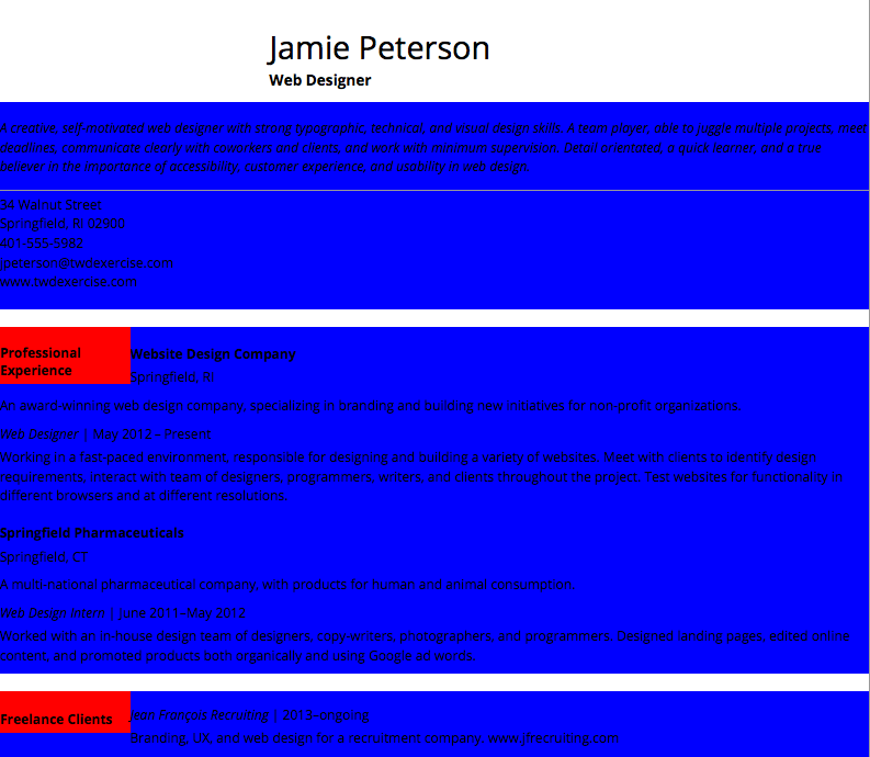
For example, I created a .cat-column class that is 15% wide, red, and floats left. (It is set to float because it will be a column and needs to be placed side-by-side with other divs.) I then added the div tags with the class=”cat-column” around the appropriate text, and viewed the page:
Carefully Create and Add Each Kind of Div you Need.
And at some point things will go terribly wrong.
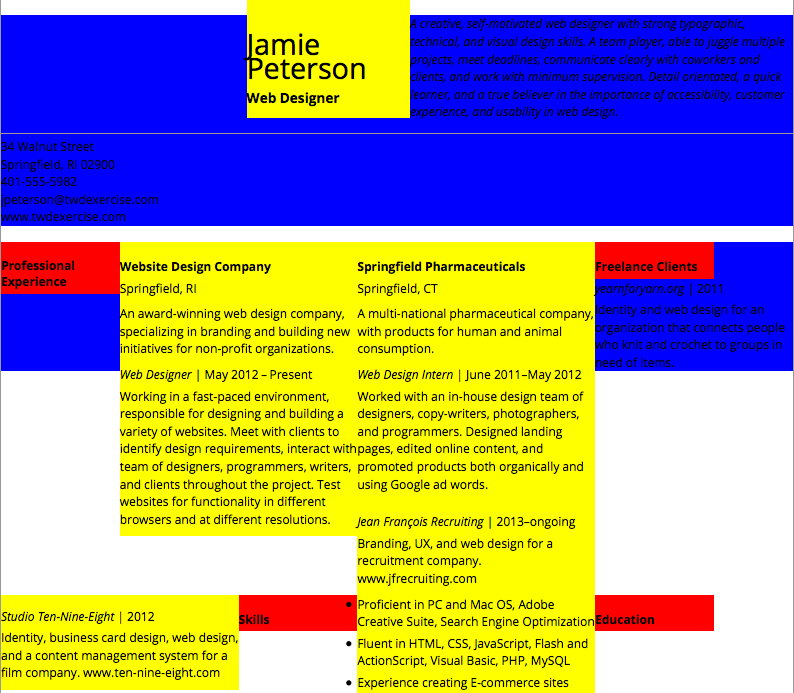
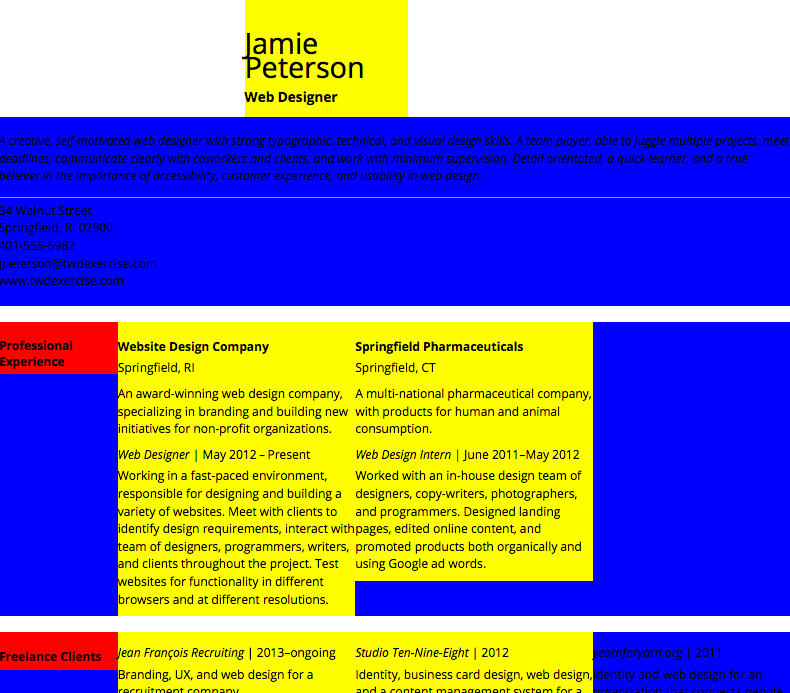
Here, I’ve added the .content-column div, which is 30% wide, is yellow, and floats left. When I check the page in my browser, this happens.
The resume above is more appropriate as a Post Modern resume than a modern resume. The problem is I didn’t float my rows. When mixing-and-matching “floated” and “un-floated” elements, things can get wonky. Why? Because the browser recognizes floated and un-floated elements differently in the structure of the page.
There are multiple ways to fix this.
The quickest and easiest? Float the un-floated element.
I added a float:left to my row, like so:
.row{
   width:100%;
   background-color:blue;
   margin-bottom:20px;
   float:left:
   }
And once again, all is right in the world (or at least in my browser).
Finish Creating and Adding “Kinds” of Divs
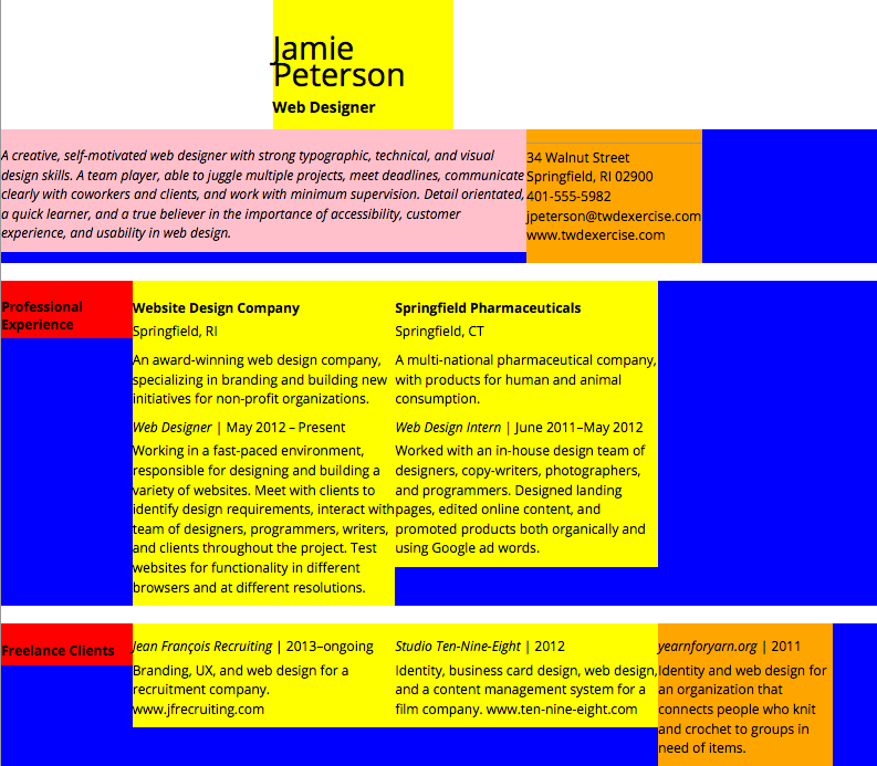
I created and added a .narrow-column div, which is 20% wide, orange, and floats left. I then created and added a .double-column div, which is 60% wide, pink, and floats left. When I’m finally done putting all of my new divs in, my page looks like this:
Set Up the Mobile Structure
I told you to remove all the original columns, which means you’ve also removed all of the column-width settings for the mobile version. You’ll need to reset that.
When I look at my mobile structure, it looks like this:
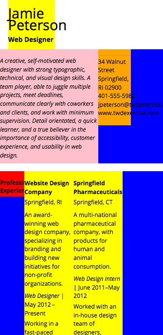
My mobile version doesn’t work. Why? I removed all the original columns and replaced it with a new structure. This new structure needs to be styled!
In the Classical resume, I found setting my columns at 90% with a 5% left padding worked really well for the mobile view. I’ll start with the same measurements here. But I’m going to set it up a little differently.
Use a Left Margin… on the Row
One of the hardest things to learn from reading or lecture is the difference between margin and padding. When you start using them to do specific things, they get much easier to understand.
For example, I could set my .cat-column, .content-column, .double-column., and .narrow-column so they are 90% wide and have 5% left padding. That would be fine. It gives me a line length and left and right space that works well. On the other hand, I could set them so they are 90% wide and have a 5% margin. That would be fine in terms of line length and right and left space too.
The problem arises when I want to add a red top border on my .row divs.
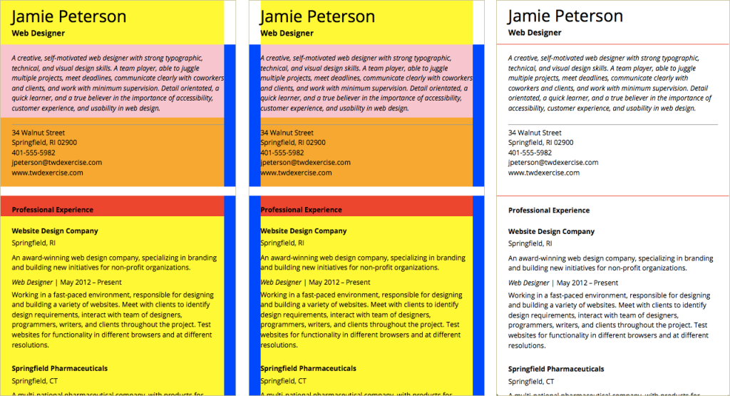
Left: A 5% left padding (space inside the div) on the divs inside the rows. Middle: A 5% left margin (space outside the div) on the divs inside the rows. Right: Either approach makes a red border-top on the rows too wide.
The example above shows the difference between margin and padding. In all cases, the .row is set at 100% width. On the far left, the divs inside the rows are set to 90% width with a 5% padding-left. Padding adds space inside a div. Notice the 5% space shows the background color of the div it’s been added to.
In the middle, the divs inside the rows are set to 90% with a 5% margin-left. Margin adds space outside a div. Notice the 5% space is blue. That’s because the space is outside the div it’s been applied to, so the background color of the row is seen.
On the far right, the background colors have all been removed and a red border-top has been added to the rows. I want the border-top to be the same width as the text. So neither of these solutions work for me.
The solution is to set the rows 95% wide with a 5% left margin.
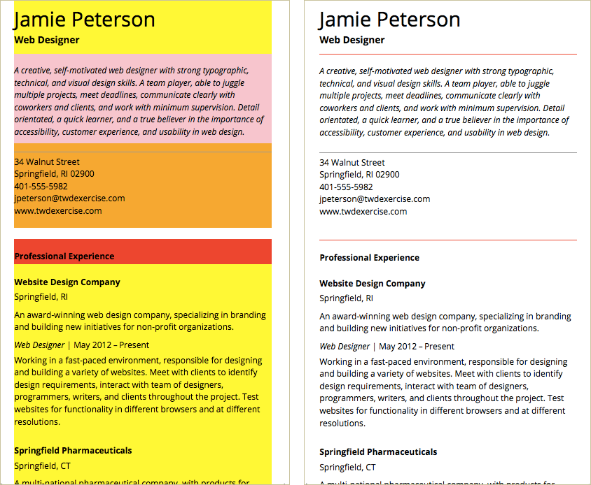
Left: 100% width divs inside a 95% width row with a 5% left margin (space outside the div). Right: Adding a red top-border on the row works. The top-border is lined up with the text.
Set Up the Break Points
Working your way up from the mobile layout, decide where you need your single column layout to turn into two columns, three columns, or even four columns. When you run into a problem at a media query, make notes on how to fix it. Then tackle the problems one at a time.
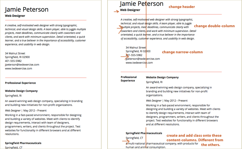
Left: A 550px media query allows me to narrow the row width slightly and keep a good line length for reading text. Right: A 766px media query causes more problems. I want a two-column layout. I’ve got the cat-column and first content-column working, but need to attend to the other divs.
For example, at my 766px media query, the page looks chaotic. Notes to myself help me solve each problem one at a time. For example…
Create and add a class onto some of the content-columns. In a two-column layout, some content columns need to move over so they are aligned with the others.
I create a class called move over and gave it the left margin needed:
.move-over{
    margin-left:25%;
    }
Then I added it to the class already defining that div:
<div class="content-column move-over">
...
</div>
A note about adding another class on some of the content columns:
- There is nothing wrong with using more than one class on an element. I do it all the time and it can make building a website much easier.
- But when it’s used for something hard to keep track of (e.g., adding/removing space vs changing a color), it can cause problems in other media queries.
- If I had thought about the middle break point — the one where the layout goes from one column to two columns — I would have realized that one more kind of div would be helpful. Keep that in mind as you develop your work process.
Exercise Complete to here. My header is wonky on my four-column (898px media query) and I can’t figure out how to fix it! It’s good when the teacher runs into problems too. 🙂
Refine the Basic Typography & Vertical Spacing
If you’ve got everything working, refine your basic typography. Make sure size, line-height, and vertical spacing is working for you. Refine your column widths and media queries if needed (for best line length possible).
Line Height and Vertical Spacing System
Change the vertical spacing system to work with the line-height. For example, the number 22 (the line-height is now 22px) is now my base. This reduces the numbers in my system. It will force me to shift from a 5, 10, 20 system to a 11, 22 system. If I need more options in my system, I might work with either a 20 or a 24 base.
Set Up the Hierarchy
Make sure your hierarchy is working. For example, when the layout is only one column, my h2 needs to be bold and stand out from the h3 (which is also bold). But once the layout becomes two or four columns, the h2 uses space to give it emphasis. I can set the h2 to normal weight.
Typographic Detail: Dealing with the List
My “skills” are set using an unordered list. On large screens, I want the items to show up without bullets and in two columns. On small screens, I want them to be a single column with bullets.
Final changes to the borders too! Remove border from top row, add a thicker border above Jamie Peterson’s name.
Quick Tips
Here are some resources related to this lesson
- The cross browser testing site used in this lesson is Sauce Labs.
- Testing fonts can be long and painful. I’ve tested hundreds of web fonts already and posted the good ones at Good Web Fonts. They all work well across browsers and operating systems.
- If you want to learn more about why the method I give for fixing faux fonts works, read “Avoiding Faux Weights and Styles with Google Web Fonts” by Laura Franz.
