Earlier I wrote about legibility, and the importance of choosing fonts with strokes and spaces that hold up on the screen. But creating readable text is more than just working with legible fonts.
Reading is a complex activity. Readers use both their foveal (central) vision and their peripheral vision to process more than one word at a time; they fixate on certain words while filling in the rest. Readers scan across lines of text while also scanning down the text, either to the next line or the next paragraph. Readable text promotes both horizontal and vertical scanning; readability is a function of multiple things, including size, line height, line length (measure), and alignment.
Size
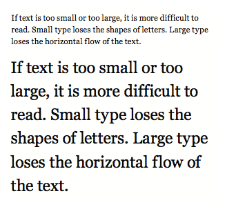
If type is too small, it loses legibility. The shapes of letters (both the strokes and spaces) are less pronounced at small sizes. Readers have to slow down to recognize individual letters or word shapes. It is difficult to process more than one word at a time if text is too small.
If type is too large, it undermines the horizontal flow of the text. Large words take up more space in our foveal vision, making it difficult for readers to process more than one word at a time.
Small type (12px or smaller) and large type (18px or bigger) can be difficult to read and should not be used in text. They are more appropriate for captions, pull quotes, and headlines. Top: Georgia 10px. Bottom: Georgia 20px.
I recommend setting text type at 14 to 16px. Fonts with a large x-height look bigger and will work fine at 14 to 15px. Fonts with a small x-height look smaller, and need to be set at 15 to 16px. I rarely set large amounts of text at 13px or smaller; it’s harder to read.
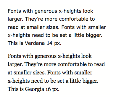
Fonts with smaller x-heights need to be set a little bigger to remain legible. Top: Verdana 14px. Bottom: Georgia 16px.
Line Height
Line height controls the amount of space between lines of text. The lines of text should feel like horizontal lines, not like a tightly woven fabric.
Readers scan both horizontally and vertically, and if the line height is too tight, it undermines the horizontal flow of the text; readers will find themselves scanning down the text, even when they don’t want to.
If the line height is too loose, the lines of text start to “float away” from each other. They no longer feel like a cohesive unit of text, and vertical scanning becomes more difficult.
A good rule of thumb is to set your line height at approximately 145-150% of your text size. For example, 14px text often works well at a 21px (150%) line height, 15px text often works well at a 22px (146%) line height, and so on. Every font is different, but 145-150% is a good place to start.
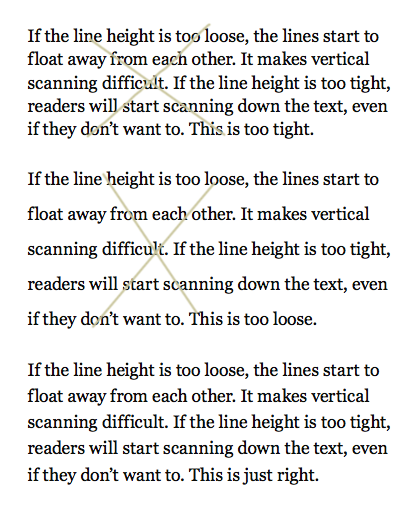
Set line height at approximately 150% of font size to promote both sustained and casual reading. Top: Georgia 15/18px is too tight. Middle: Georgia 15/30px is too loose. Bottom: Georgia 15/22px is good.
Text fonts designed for the screen tend to have slightly larger x-heights—this creates more internal space in the letters, which is necessary to promote legibility in low-resolution conditions. A large x-height means there is less “automatic” space between lines of text. The space is taken up by the letters themselves. Thus a font with a generous x-height also needs a generous line height; a font with a smaller x-height can work with a smaller line height.
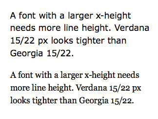
Verdana has a larger x-height (and looser letter-spacing) than Georgia, and so Verdana needs a looser line height. Top: Verdana 15/22px is slightly too tight; the text doesn’t have a strong horizontal line. Bottom: Georgia 15/22px is good.
Depending on the amount of text, the line length, the font size, and the size of a font’s x-height, you may find that the line height needs to be tightened or loosened slightly to promote comfortable reading. That’s okay. You don’t have to follow the 145-150% rule to the letter. It’s there as a guideline. Read the text, see how the lines of text relate to each other, and make adjustments as needed.
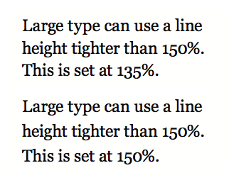
Lines of large type, used for small amounts of text like headlines and pull quotes, can use a line height tighter than 150 percent. Top: Georgia 20/27px is good. Bottom: Georgia 20/30px creates lines that start to float away from each other.
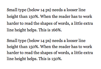
Small type needs a looser line height to help promote horizontal eye movement. Top: Georgia 12/20px is easier to read. Bottom: Georgia 12/18px.
Measure (Line Length)
Long lines of text are harder to read because they force readers to change their eye movement. Readers want to scan across and down the text at the same time, focusing on a couple of words and filling in the rest. When lines of text are long, readers need to work harder to scan across an entire line, then go back and find the start of the next line.
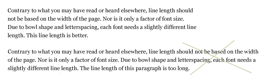
Top: A 75-character measure (line-length) is easier to read. Bottom: 100+ character measure is too long.
Short lines can make text feel chopped up, causing a reader’s scanning to become more vertical than horizontal. Short lines break up the intended rhythm of a text meant for sustained reading. In addition, short lines can undermine the shape of a text block, creating extremely ragged edges on one side of the text, or creating large white spaces in justified text. Use short lines for captions and lists.
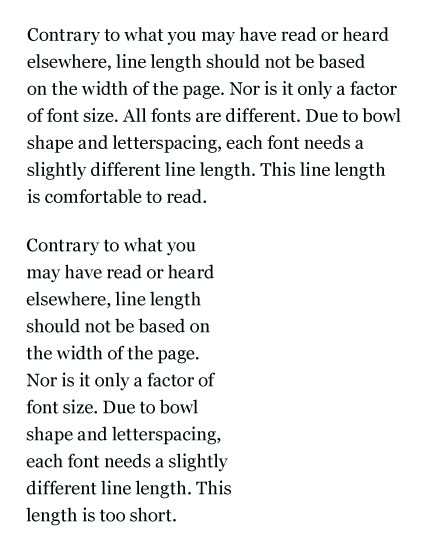
Top: A 46-character measure (line length) is comfortable to read. Bottom: A 22-character measure can make the text feel chopped up. It’s appropriate for captions or small amounts of text, but not for extended reading.
Avoid Doubling
Have you ever found yourself reading the same line over and over? This is called doubling. It is usually caused by lines of text that are too long. The long lines undermine our ability to scan down the text.
Contrary to what you may have read or heard elsewhere, line length should not be based on the width of the page (that is, how much space you have to fill). Nor is it only a factor of font size. All fonts are different. Due to bowl shape and letter-spacing, each font needs a slightly different line-length.
The best way to determine line length is to count the number of characters on a line. Reading text on the screen is most comfortable at 45 to 75 characters (including punctuation and spaces) per line.
Count Characters
Line length is measured in characters, not pixels. A comfortable measure is 45 to 75 characters. When counting characters, include all punctuation marks and spaces. Count the characters in two or three typical lines of text. The average number of characters is your measure.
Alignment
There are five ways to align text: left aligned, right aligned, centered, justified, and asymmetrical. Each method has pros and cons related to ease of reading and formal beauty and integrity.
Right aligned, centered, and asymmetrical text is more difficult to read. The starting point for each line varies. Readers have to find the start of each line, which undermines vertical scanning.
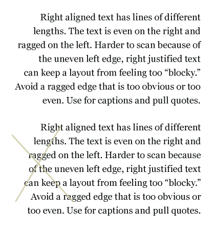
Right aligned text. It’s hard to control the ragged edge, especially in responsive sites. But it’s good to know what to strive for. Top: A good ragged edge. Bottom: Lines are too even, creating a less successful ragged edge.
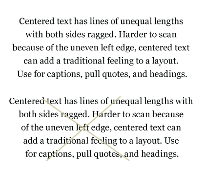
Centered text. Top: Good ragged edges. Bottom: Lines form a slightly triangular shape, creating less successful ragged edges.
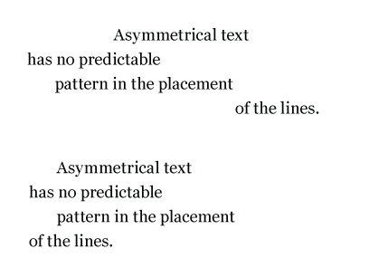
Asymmetrical text. Top: Harder to read because of the uneven left edge, asymmetrical text can add a sense of motion or transition to a layout. Use this alignment for headings and pull quotes. Bottom: A less successful asymmetrical alignment with a predictable pattern.
These alignment methods do add pleasing shapes (form and counterform) and visual interest when they are done well. They are great for small amounts of text that do not require sustained reading or purposeful scanning. Consider these alignments for captions, pull quotes, and headlines.
Asymmetrical alignment is not available as a CSS value. Lines of text have to be individually placed to create asymmetry.
Left aligned and justified text is easier to read because each line starts at the same place. Readers do not have to find the start of each line, which promotes vertical scanning.
Unfortunately, both alignments can add unwanted visual elements if they are not set well, such as a misshapen ragged edge, or white “rivers” of space within a block of type. These problems are more prevalent if the line-length is too short.
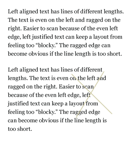
The ragged edge on left aligned text shouldn’t be too equal or too obvious. Top: A good ragged edge. Bottom: A less successful ragged edge, creating a concave shape.
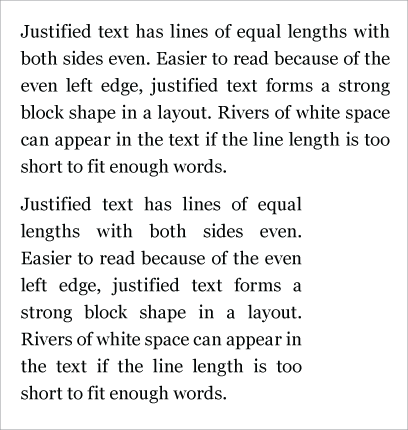
Word spaces in justified text open and close to keep line lengths even. Top: Good word spacing. Bottom: A shorter line length creates awkward rivers of space.
The shape of the text block does matter. Text is for reading. If text blocks add shape, it should be for a purpose, and the shapes created should be beautiful and meaningful. The best text blocks are those that contribute to the rhythm and tension of a page without screaming, “Hey, look at me, I make a triangle!”
Avoiding Widows and Orphans
“Orphans are alone early in life; widows are alone late in life.” While not a happy statement, this phrase can help you remember the difference between orphans (words or lines of text alone at the start of a column or text block) and widows (a word or words alone at the end of a column or text block).
Widows and orphans are words or lines of text left on their own, apart from the rest of the text. They disrupt the flow of reading, creating a gap in the text the reader must cross. Widows and orphans create unintended chunking. They insert extra space into a typographic design, and create emphasis (contrast of space) where you don’t want it.
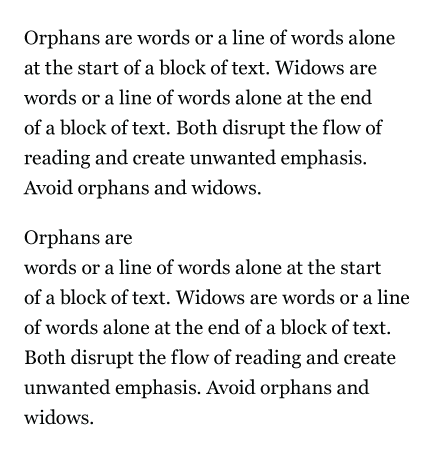
Top: A properly set paragraph without a widow or orphan. Bottom: Widows and orphans add space and create emphasis where you don’t want it.
You’ll almost never need to worry about orphans and widows at the start and end of columns. Why? Because it’s not good manners to set web text (prose) in more than one column. Good web typographers don’t make readers scroll down and then back up again in order to read the complete text.
The most difficult problem to avoid in web typography is the widow at the end of a paragraph.
It’s impossible to completely avoid widows in web typography. Traditionally, print typographers make subtle changes to the layout: shifting type size, line length, letter spacing, line height, and column height to avoid widows.
But in web typography, we lose that control. We cannot size text in fractions of a pixel. Browsers render text with slight differences, often adjusting letter and word spacing. Readers can change the size of the text in their browser. Content is flowed in from databases, not entered and carefully crafted by a typographer.
The best way to avoid widows is to control what you can: font size and line length. Set the font size big enough so that readers won’t need to increase it on their end. Use a line length long enough to accommodate longer words.
And let the rest go. Don’t hand-craft a rag by peppering your text with <br> tags. It will backfire on you.
Quick Tips
Text on the screen is easier to read when…
- Font size is 14 to 16px
- Line height is at least 140-150% of font size
- Line length is about 45 to 75 characters
- Text is aligned left or justified
- Avoid widows and orphans by changing font size and line length. Don’t hand-craft a rag by peppering your text with <br /> tags.