Overview of the Assignment
In this exercise you create a system of headings to help potential employers scan Jamie Peterson’s resume.
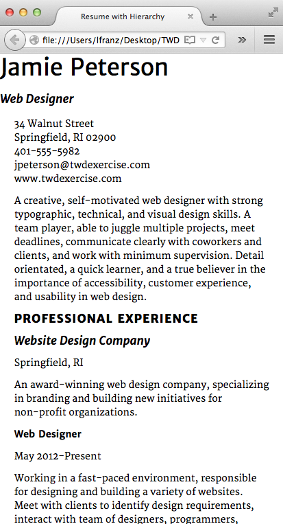
- If possible, print out the resume you built in the last exercise (or take a screen shot).
- Identify the levels of hierarchy you have to work with. What is your h1? Your h2? Your h3? Your h4 (if any)? Your p?
- Identify other areas in need of typographic work. The resume includes a professional statement and job descriptions. Should they be handled the same way as all the other text, or do you want them to feel slightly different?
- Create a typographic system for your headings with clear levels of hierarchy. Use contrasts in font, size, case, style, weight, and letterspacing as needed, and remember to…
- Use similarity in your system to emphasize contrasts.
- Sketch out a couple of options for creating hierarchy.
- Make a copy of the resume folder from the last exercise. Rename it resume_hierarchy. Rename your CSS file resume_hierarchy.css, and link to it.
- Apply the new hierarchy system. Create classes and use <strong> and <em> as needed.
- Follow the walk-through provided. Read what a typographer looks for in the process.
Be willing to change your headings as you progress through the system. What seemed like a good idea in theory may not work in reality. You may find a heading level needs more or less hierarchy.
Note: designing with type is far more fluid than this resume project suggests. Dividing the project into four lessons allows you to focus on specific ideas and skills, but in future projects you will often create and apply type size, leading, line-length, hierarchy, and vertical spacing at the same time.
Getting Started
Identify the Levels of Hierarchy
Always start by analyzing the text you’re working with. Know what your headings are and how many levels of hierarchy you need. Look for other areas of the text that may need a more subtle treatment than headings, but still feel like they need to be treated differently from the rest of the text.
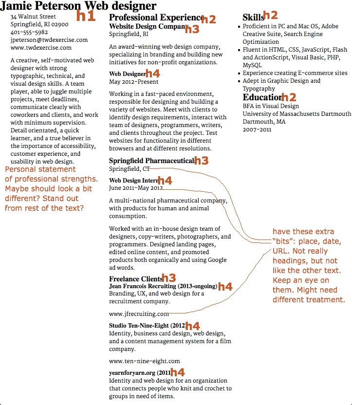
Mark up your resume so far (a print out or screenshots). Where are your headings? Is there other text on the page you need to think about and pay attention to?
Explore Possible Solutions
Here’s a tip: When I develop a system of hierarchy, I’ll often work from the two extremes. For example, I’ll think about my h1 and h4 tags first, so I like the way they work in the composition (h1) and in relation to the text (h4). Then I’ll set my middle levels accordingly (usually working up from the h4 tag).
Try a couple of systems of hierarchy with your chosen font(s). Below is the evolution of one of my ideas. I would usually sketch or mock-up both the mobile version and the laptop version (just to make sure I don’t run into any unexpected problems), but since I want to emphasize the importance of designing for mobile first, I’ve only mocked-up the mobile version. We’ll see what happens!
I started with the idea on the left (below). I thought using italics would make the text feel more personal. Warm, human, someone the potential employer would enjoy having on their team. But it ended up with too much italic for my taste. The type started feeling a bit fussy and the italics had too much visual texture.
So I tried a new approach. Instead of using italics for three elements (name, professional statement, job titles) I used it for only two elements (“web designer” and company names). This kept the personal touch, just less of it. This approach had the added benefit of making the job titles seem a bit more stable/powerful (because I switched them from bold italic to bold). This was a pleasant unexpected development.
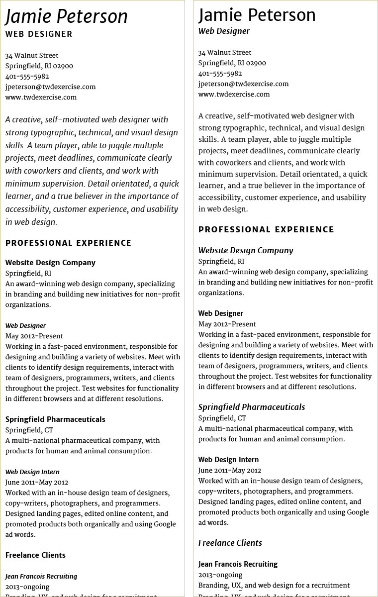
Left: My first idea had too much italic text. I wanted it to feel warm and personal. Instead it started feeling fancy and fussy to me. Right: I pulled back on the italics and reconsidered some of the heading sizes. This had the added benefit of making the job titles feel a bit more powerful.
While the job titles had more presence, I didn’t like how small/short they looked compared to the time spent in each position. And the varying line-length gave the text an awkward ragged edge. To solve both of these problems, I tried moving the dates up onto the same line with the job title (below left).
The job titles and dates didn’t have enough contrast when they were on the same line, so I added a “pipe” between the two. This created just enough visual separation. I don’t know if this is a perfect solution, but it’s good enough for me to start building it.

Left: Combining job title and dates worked made the text feel more substantial and fixed the ragged edge. But there wasn’t enough contrast to visually separate the two kinds of information. Right: Adding a “pipe” helps separate the info and adds a small visual detail to the type.
Start Building the Page
Create the Lesson Folder
In this exercise, you’ll modify the resume you set up in the last lesson, so make a copy of the resume folder and name the new folder resume_hierarchy. Keep it in the web_typography folder.
Set Up Your Files
Rename the CSS file resume_hierarchy.css. Link it to the index.html file by going into the HTML file and changing the syntax in the head element to the following:
<link href="resume_hierarchy.css" rel="stylesheet" type="text/css">
Change the title to
<title>Resume with Hierarchy</title>
Apply Your System of Hierarchy
You’ve already marked up on your printout where the headings are, and figured out how you might set them. Start with what you know.
Set h1, h2, h3, h4 for Mobile View
For example, you know what you want your h1, h2, h3, h4 to look like. And you know you’re setting the headings for the mobile view. In your CSS, add the descriptions for those four headings in the correct place for the mobile view. (Remember, mobile first.)
Notes on setting hierarchy in CSS:
- Remember, heading will automatically load as bold unless you state otherwise. For example, in my design, I set the h1 font-weight to normal.
- If you’ve been using Google Fonts, you’ve probably noticed they use “400” for regular weight and “700” for bold. There are more weights available in some font families. For example, in my design, I’ve set the h2 font-weight to 800. If you want to learn more, I recommend this short explanation about font weights.
- You’ll be adjusting vertical spacing in the next exercise. But it can help to see hierarchy if elements are separated a bit. For example, on all my headings, I’m using a bottom padding of 12px (the same as the text).
View Your Web Page
Take a look at your web page (browser narrow to mimic a mobile view). What needs to change?
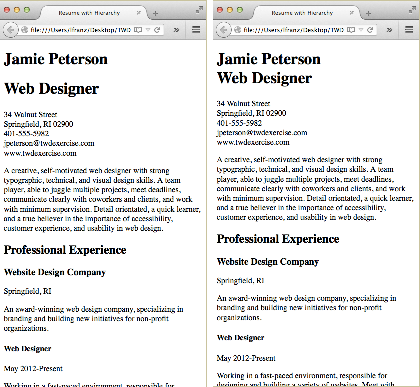
My first attempt at adding hierarchy. I need to fix my h1 (I want “web designer” to look different), h4 (I want it on the same line as the dates), and professional statement (I want it bigger than the rest of the text).
On my layout, there are three things I want to change. First, my entire h1 is big and Roman. I want “web designer” to be smaller, bold, and italic. Second, my h4 are the right size and weight, but I want them on the same line as the dates that come after them. Third, I want Jamie Peterson’s professional statement to be slightly larger than the rest of the text. So it feels a bit different.
I recommend you tackle your changes one-by-one.
Give the h1 Two Styles
I want “web designer” to look slightly different from Jamie Peterson’s name. But it’s still part of the h1. This can be done one of two ways. Both approaches require a class, so start there.
Create and Style a Class in CSS
I want “web designer” to look like the h3 in my layout. So I’ll create a class called “web-designer” and style it accordingly. If you are running into the same problem, style your class according to your own design.
.web-designer{
    font-size:17px;
    line-height:20px;
    font-style:italic;
    font-weight:bold;
    padding-bottom:12px;
  }
Notes on my CSS:
- I’m changing all of the properties except font-family (size, line-height, style, weight) from Jamie Peterson’s name, so I must include them.
Apply the Class in the HTML
Jamie Peterson looks one way. The words “Web Designer” looks different. They are both part of the h1. The h1 can only have one look (not two). Much like the X in Gallery X, I have to apply a class to part of the h1 in order to create two different “looks.”
I can apply the class in one of two ways.
The first option uses two h1s… I can wrap Jamie Peterson’s name in h1 tags, then wrap “Web Designer” in h1 tags. This will give me two h1s. Then I can apply the class to the “Web Designer” h1 — much like you applied the .intro class to the introduction paragraph in your bibliography and Gallery X assignments.
The HTML would look like this:
<h1>Jamie Peterson</h1>
<h1 class="web-designer">Web Designer</h1>
Benefits to this approach? Using two h1s creates an automatic line break between the two. Disadvantages to this approach? Using two h1s on a page is not recommended unless each h1 is used as the heading for a new section or subsection. This approach uses two h1s just to style the text. So it’s not semantically correct.
The second option uses the span tag… I can keep both Jamie Peterson’s name and the words “Web Designer” wrapped in the same h1 tags, then use a <br> tag to break the heading into two lines. Then I can use a <span></span> element to wrap the class around “Web Designer.”
The HTML would look like this:
<h1>Jamie Peterson<br>
<span class="web-designer">Web Designer</span></h1>
Benefits to this approach? Using one h1 means I don’t have two headings for one section of content. Disadvantages to this approach? I needed to use a <br> tag to break the content into two lines. Breaking text this way can lead to problems (odd line breaks on different browsers) if not used carefully. But it will be fine here.
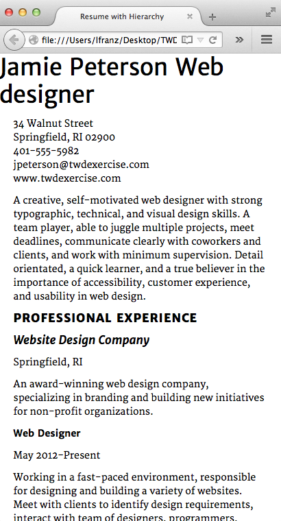
When I can’t decide between two approaches to styling text the way I want it, I often think about how the text would look if the CSS didn’t load and everything had default styling. In the image below, I’ve turned off the CSS in Firefox (View > Page Style > No Style).
Left: This file has two h1s. Without the CSS, the two lines for the heading look alike, but there is a big vertical space between the two. The read like two separate headlines. According to the HTML they are. Right: This file has one h1 with a <br> tag to break the line. Without the CSS, the two lines for the heading look alike… and are grouped together. They read like a single headline.
To fix my h1, I will use the second option: keep the heading in a single h1, break the line with a <br> tag, then use a pair of <span></span> tags to apply the .web-designer class.
View Your Web Page
Take a look at your web page (browser narrow to mimic a mobile view). Did everything work? What needs to change?
“Web Designer” is fixed. It’s still an h1, but looks like the h3s. Now if only it were lined up with the rest of the text.
Line Up the h1
I’d like my h1 to line up with the rest of the text below it. This is a pretty simple fix. All of the other divs, now showing up as a single column, have a left padding of 5%. I simply added a matching left padding to my header, like so (use whatever % works in your layout):
header{
    display:block;
    padding-left:5%;
    }
Make the h4 an Inline Heading
I want my h4 to act as an inline heading. This means I want it on the same line as other text. I don’t want a line break. I could fix this problem in one of two ways.
My first option… is similar to how I fixed my h1 problem. I could wrap the whole line in a pair of <p></p> tags, then style the inline “h4” by wrapping it in a pair of <span></span> tags and applying a class.
My HTML would look something like this (and my class would be styled accordingly in the CSS):
<p><span class="inline-h4">Web Design Intern</span> | June 2011-May 2012</p>
My second option… Wrap the whole line in a pair of <p></p> tags, then wrap the inline “h4” in a pair of <strong></strong> tags and style the strong element so it looks the way I want it to.
My HTML would look something like this (and strong would be styled accordingly in the CSS):
<p><strong>Web Design Intern</strong> | June 2011-May 2012</p>
The second option is the better solution. Again, I can think about how the text would look if the CSS didn’t load and everything had default styling. In the image below, I’ve turned off the CSS in Firefox (View > Page Style > No Style).
Without CSS, the inline heading created with a class no longer has emphasis. All the styling is gone (by default, classes don’t have any styling). The inline heading created with the strong element continues to have emphasis. Because strong has a default bold weight.
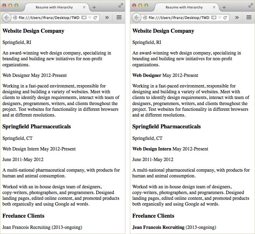
Left: Using a class to create an inline heading is not as semantically accurate as using <strong></strong> tags. Without the CSS all styling is lost. Right: Without the CSS the <strong></strong> element is still bold by default.
Modify the Professional Statement
Finally, I’d like Jamie Peterson’s professional statement to be a bit bigger than the rest of the text. To do this, I created a class called “statement”, styled it in the CSS, and added it to the statement paragraph.
Try doing this on your own. If you can’t remember how to do it, look at the introduction paragraph of your bibliography pages or your Gallery X page.
Test at Different Size Browsers
View your web page at different sizes. Make changes to your h1, h2, h3, and h4 as needed.
If you have things you want to fix at certain breakpoints, try writing out the problem. This often helps me solve specific problems. For example: “When the layout is two columns, I want the h1 to…” This can help you identify what element to change, what styling on the element needs to change, and what media query to make the change in!
View Your Web Page
Take a look at your web page (browser narrow to mimic a mobile view). Did everything work? What needs to change? Mine looks pretty good. I’m ready to move on.

Go Back and Make Changes If Needed
Here’s a secret: good web typographers (just like a good web anything) don’t always know exactly how a web page is going to work before they build it. There’s always something to figure out, and sometimes it takes a lot of time, patience, and attention to detail.
Finding a good system of hierarchy takes time and effort.
If you keep making changes, but the hierarchy doesn’t feel exactly right to you yet, that’s OK. A good system of hierarchy works hand-in-hand with vertical spacing between elements. You’ll work on that next.