At this point, you have a working resume web page. It could go online as is. Jamie Peterson’s potential employers can easily scan the information, stopping to read what they want or need to.
But there are details you can attend to—numbers, acronyms, special characters, and punctuation—to make the layout more beautiful while making the text even easier to read.
Numbers and Acronyms
You learned earlier that there are two kinds of numbers: lining figures (which look more like capital letters) and old-style figures (which look more like lowercase text). It is good manners to use old-style figures in text so the numbers don’t YELL at the reader.
There are also two kinds of acronyms. Acronyms pronounced as a word (scuba) are set in lowercase. Acronyms pronounced as the letters (DVD) are set all caps. Acronyms can YELL, too.
If you must use lining figures or acronyms set in all caps, de-emphasize their size when possible. There are font families that include a “small caps” option. Most typographers would tell you that a “small caps” font is the best solution. Personally, I find most “small caps” fonts are too small compared to the regular font, and their miniscule size makes them stand out in text.
I personally prefer to set my acronyms 1px smaller than the text size. This keeps them from jumping out due to size (whether too small or too large). If you prefer to use a “small caps” font, that’s fine too.

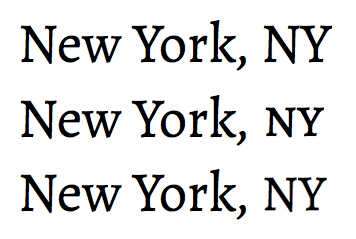
Top: When set in all caps, acronyms stand out too much. Middle: Most typographers prefer to use a “small caps” font to set the acronyms in small caps. Bottom: I prefer to slightly reduce the size of the acronyms by 1px. Don’t make them any smaller though! They’ll look too light and wimpy compared to the text.

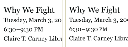
Left: The full-size capitalized PM stands out too much in the text. Right: If your text has capitalized acronyms, create and apply a class to make them 1 pixel smaller. If they stand out because they are too small compared to the text around them, keep them the original size. The point is to help capitalized acronyms blend in, not draw attention to them.
You can de-emphasize lining figures the same way.

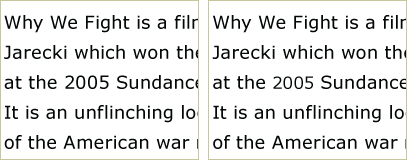
Left: Full-size lining figures stand out too much from the text. Right: If your text has lining figures, create and apply a class to make the numbers 1 pixel smaller. If the numbers now stand out because they are smaller than the text around them, keep them the original size. The point is to help lining figures blend in, not draw attention to them.
Punctuation and Special Characters
Punctuation marks and special characters require a bit of attention. The punctuation marks most often in need of your attention are quotation marks and the en and em dashes, because they occur most often. HTML cannot render true quotation marks, en and em dashes, and other special characters properly unless you insert character codes. Why? Because they are not keyboard characters; you can’t just “type them in.”
Special characters and punctuation marks can be added to your web page using character entities. There are two common forms of character entities: numeric and semantic. The numeric character entities have the reputation of working across more browsers (including old browsers), but I recommend using the semantic character entities (because they are easier to recognize and remember, and they work fine in contemporary browsers).
Quotation Marks
A true quotation mark is a curly quote, a mark that is as graceful of the other characters around it.
The default quotation mark in most software programs is the double prime (the symbol used when writing out a measurement in inches). The double prime, sometimes referred to as “dumb” quotes, is a pair of little vertical hashes that impede the horizontal flow of reading across a line of text.

Left: “Dumb” quotes. Right: True quotation marks (also called smart quotes) are double curly quotes (“ and ”). They are as graceful as the other characters in the text. Notice the apostrophe (’).

Left: “Dumb” quotes. Right: Sans serif fonts (usually monoline) often use angled quotation marks instead of curly quotes. Notice the apostrophe.
To replace prime marks with true quotation marks, use the following code:
- Double left quotation marks “
- Double right quotation marks ”
- Single left quotation marks ‘
- Single right quotation marks (used as an apostrophe) ’
En Dashes and Em Dashes
The en dash is used to indicate a range. Think of the en dash as “between” or “to.” Examples of where to use an en dash include 3–5 years, 2:30 PM – 3:30 PM, and January–March.

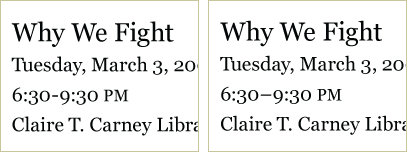
Left: An incorrect use of a hyphen. Right: An en dash (–) is longer than a hyphen, and half the length of an em dash. An en dash indicates a range. Here it means from 6:30 PM to 9:30 PM.
The default en dash in most programs is the basic hyphen. To replace a hyphen with an en dash, use the following character set:
–
The em dash is used to indicate a break in thought. It’s used the way parentheses are used—when a comma is too weak, but a period is too strong. It is also used to indicate an unfinished sentence (like when a speaker has been interrupt —), or to create emphasis.

Left: An incorrect use of two hyphens. Right: An em dash (—) is twice as long as an en dash. It indicates a break in thought, an interruption, or an emphasis. Here it is used to emphasize the word corn.
The em dash is usually indicated by two hyphens. To replace two hyphens with an em dash, use the following code:
—
Special Characters
Special characters are any character you cannot create with a single key stroke. Beyond punctuation marks, the special characters you will probably use often are ampersands (&), the copyright symbol (©), and the “hamburger/pancake icon” (≡).
Special characters are also used to set accented letters, such as the ç (ç) in the name Jean François in the text. Whenever possible, use the correct accented letters—even if it means a couple extra keystrokes.
There are dozens of reference charts available for the character entities you need to create special characters in HTML. One of my favorite reference charts is listed under Recommended Resources on every page of this site. If you find another reference chart you like better, feel free to use it.
Quick Tips
When attending to details, remember…
- If you must use lining figures or acronyms in text, try making them smaller so they don’t stand out. If the smaller size makes them stand out more, return to the original size.
- Use syntax to create curly quotes, em dashes, en dashes, and other special characters.
If you want to learn more about small caps…
- Read “Small Caps” by Ilene Strizver