A web page layout often requires multiple columns of text and images. This means creating and styling multiple divs… and getting the divs to go where you want them.
In this lesson, you will use float, margin, and padding to create a pyramid of toy building blocks. Then you will use three classes to change the color of the blocks.
Overview of the Assignment
- Use the HTML and CSS files I’ve started for you.
- Follow the instructions to explore float and margin.
- Create the final pyramid of blocks.
- Create and use three classes to add color to the blocks.
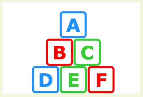
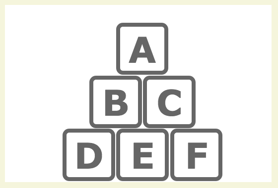
Your final piece will look something like this.
Getting Started
Use the HTML and CSS Files Provided
I’ve done the initial set up in the building_blocks HTML and CSS. There are some new elements here, such as rounded corners. Spend some time reading my syntax to see how I’ve set things up (you can learn a lot by reading other people’s files).
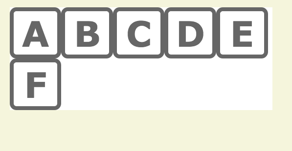
View the Page in Your Browser
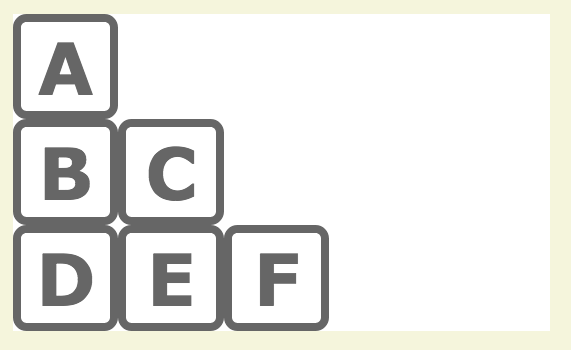
You should see a column of six building blocks, marked A – F.
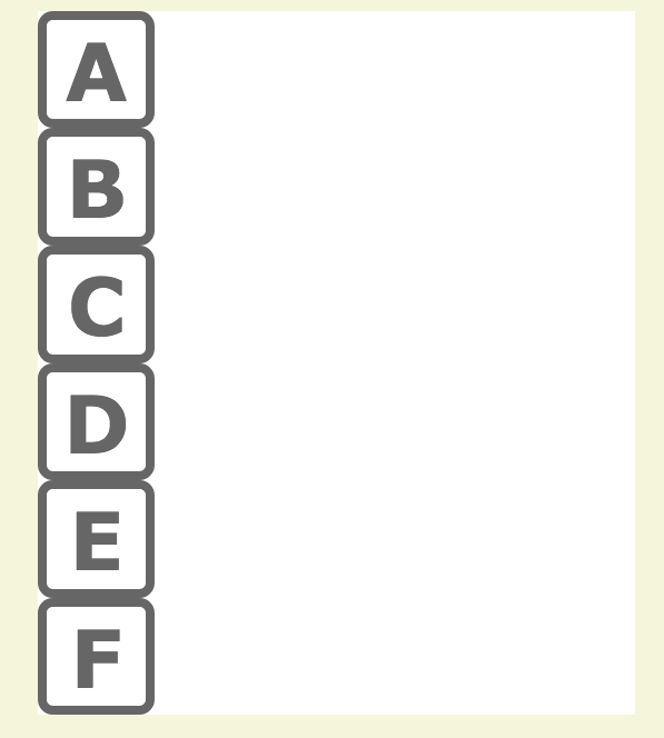
The six blocks are made with six divs. And by default, divs are block elements—they create a break (a new line) for each one. They show up as a single column of elements.
Break Out of the Single Column
You don’t always want a single column of elements. For example, in this exercise, you will eventually create a pyramid of building blocks.
Use the Float Property
To make divs live side-by-side in a row, use the float property.You can tell an element to float left or right.
In your CSS file, add the line float:left; to the #b div (new syntax in bold):
  #b{
    float:left;
    }
View Your Page
This does not look right. Instead of the B block floating up next to the A block, the C block is now covering the B block (note: on some browsers, the B block is covering the A block).
This looks wrong, but it’s the way the float property works. All side-by-side elements must be floated. Otherwise, elements without a float won’t recognize elements with a float, and things get wonky.
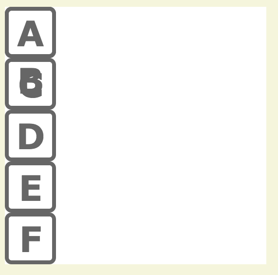
The C block is covering the B block. Why? Elements without a float don’t recognize elements with a float, and things get wonky.
Float:left All Six Blocks
In your CSS file, add float:left; to all six divs.All divs, #a through #f will have the same syntax (new syntax in bold):
  #a{
    float:left;
    }
View Your Page
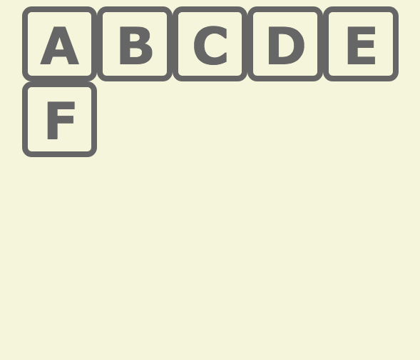
This looks better. Except F block isn’t next to the E block, and the white background is gone.
Again, this looks wrong, but it’s the way the float property works. If the side-by-side elements don’t all fit in the space provided, some will pop down to the next line.
And, since elements without a float don’t recognize elements without a float… the main_container doesn’t recognize the floated elements inside it. This causes a problem because the main_container is currently set to auto height (by default, if you don’t specify a height, an elements has an auto height).
Auto height means the main_container will only open up to the height of whatever it contains… and since the blocks are floated, the main_container doesn’t recognize them. It doesn’t know they are there.
The #main_container will only open up to the height of whatever it contains… and since the blocks are floated, the #main_container doesn’t know they are there.
Add overflow:hidden to the main_container
To get the white background back, you need to force the main_container to recognize the floated elements inside it.To do this, add the line overflow:hidden; to your #main_container (new syntax in bold):
#main_container{
   width:600px;
   margin-top:20px;
   margin-right:auto;
   margin-left:auto;
   background-color:#ffffff;
   overflow:hidden;
   }
This tells the main_container to look more carefully at what is inside it. It will recognize the floated elements and open back up to include them.
View Your Page
If your page looks like this, everything is working properly.
All building blocks are now float:left, and the white main_container has returned.
Experiment with the Float Property
Float:right; All Six Blocks
What happens if you float all six blocks to the right?Give all six divs, #a through #f the same new syntax. Change the float:left; to a float:right; (new syntax in bold):
#a{
float:left right;
View Your Page
The blocks have swapped places! The A block floats to the right, the B block floats to the right up next to the A block, and so on. And our friend the F block still doesn’t fit on the first row, so pops down to the next one.
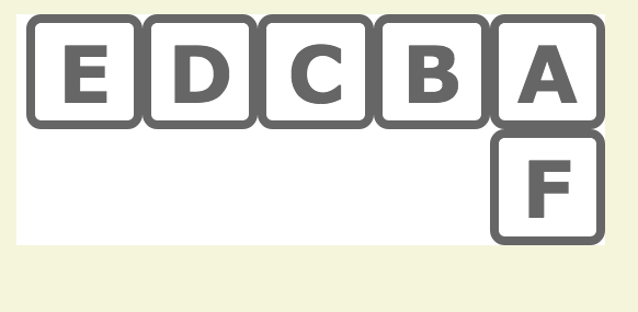
The blocks have swapped places!
Use Both float:left; and float:right;
What happens if you float A, B, C to the left, and D, E, F to the right?Give divs #a #b and #c the same syntax: float:left.
#a{
float:left;
Give divs #d #e and #f the same syntax: float:right.
#d{
float:right;
View Your Page
The A, B, and C blocks are back over on the left side of the main_container. While the D, E, and F blocks continue to float to the right. Poor F block still doesn’t fit on the first row, so pops down to the next one.
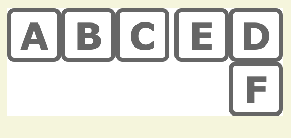
A, B, C are styled to float:left, and D, E, F are styled to float:right.
Create Multiple Rows
Sometimes, an single row of elements isn’t any better than an single column of elements.
Use clear:left;
If your elements are floated left, clear:left; tells an element to go to the next row.But once the element is in the next row, it needs to float again in order to make the next row work. Why? As shown earlier in this exericise, elements without a float won’t recognize elements with a float… and you’ve just cleared the float:left; relationship between two elements.
The trick is this:
- give the first element of a new row a clear:left;
- then put a float:left; on it.
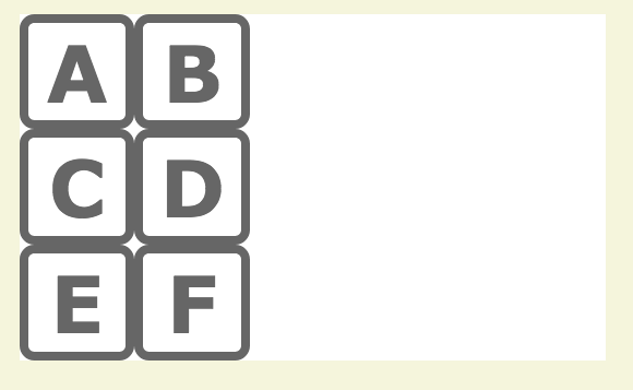
For this next layout, create three rows.
AB
CD
EF
That means you’ll need a clear:left; on #c and #e (the first element of the new row).
Below is the syntax for #a, #b, and #c. See if you can do #d, #e, and #f.
  #a{
    float:left;
    }
#b{
float:left;
}
#c{
clear:left;
float:left;
}
View Your Page
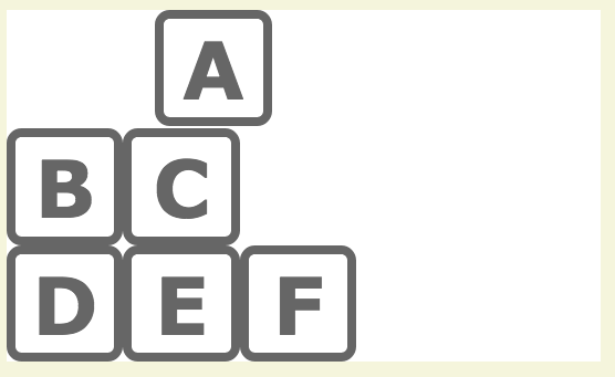
If you’ve done the clear:float; and float:left; correctly, your page should look like this. If it doesn’t, try again.
Start the Pyramid
Use clear:left; and float:left; to create three rows of increasing size.Your next layout should look like this:
A
BC
DEF
Since the trick is to give the first element of a new row a clear:left; then put a float:left; on it, I recommend you start by identifying which blocks need both a clear and a float. The others will only need a float.
View Your Page
If you’ve done the clear:float; and float:left; correctly, your page should look like this. If it doesn’t, try again.
Move the Blocks into Position
In a pyramid, each row is centered on the row below it.
Use Margin to Move the Blocks
All elements have margin and padding.Margin is the space outside of an element. It is the space between two elements. Padding is the space inside an element. It is the space between the border of an element and the content inside of it.
If it helps you to remember which is which, think of a padded envelope for mailing something fragile. The padding is on the inside of the envelope.
To move the A block over toward the center of the main_container, add some margin-left to it:
  #a{
    float:left;
    margin-left: 150px;
    }
And to make the block feel a little more like a building block, add a little bottom-margin to it:
  #a{
    float:left;
    margin-left: 150px;
    margin-bottom: 2px;
    }
View Your Page
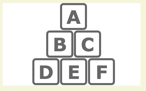
Margin-left: 150px; added space outside #a, and moved the A block over 150px. Margin-bottom: 2px; added space between the A block and the element below it. If you’ve done the margins correctly, your page should look something like this. If it doesn’t, try again.
Margin-left: 150px; moves A block over 150px. Margin-bottom: 2px; adds space between A block and the element below it.
Use Margin to Put all Blocks in Position
It may take some trial and error.Using only margin-left and margin-bottom on #a, #b, #c, #d, #e, and #f, copy the layout below.
View Your Page
If you’ve done the margins correctly, your page should look something like this. If it doesn’t, try again.
Add Space Above the Pyramid
The pyramid looks cramped in the main_container. You can add space above it with either margin or padding.
Use Padding to Add Space
I'm often asked how I know when to use margin and when to use padding.The unsatisfying answer is, “it depends.”
You used margin when moving the building blocks, because you needed to add space outside of the blocks. If you used padding-left on the A block, it would look something like this:
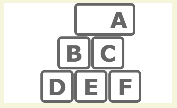
In this case, the decision is clear. Using margin-left to move the A block over was the best decision. Padding-left wouldn’t do what was needed.
But when adding space above the A block, the decision is not clear. You can use a margin-top on the A block. Or you can use a padding-top on the main_container. Either way, you’d get the same results regardless of your decision.
Since you haven’t used padding yet in this exercise, add the space by adding padding-top to the main_container like so (new syntax in bold):
  #main_container{
    width:600px;
    margin-top:20px;
    margin-right:auto;
    margin-left:auto;
    background-color:#ffffff;
    overflow:hidden;
    padding-top:40px;
    }
View Your Page
If you’ve done the padding correctly, your page should look something like this. If it doesn’t, try again.
Add Color to the Blocks
To make the blocks look more like toy building blocks, you’re going to add color to the letters and borders. You’ll do this using classes.
Use a Class to Add Color
The best thing about a class is you can use it over and over.And, if you define it properly, you can use it to modify different elements on the page. For example, if you make a class called “blue” and tell it to have the color blue and the border-color blue, you can use the same class on both the letter and the border.
In the CSS, create the following class:
  .blue{
    color:dodgerblue;
    border-color:dodgerblue;
    }
Use the class in the HTML to make both the A block and the D block blue. Add the class in two places on each block: to the class already on the div, and to the h2.
Pay particular attention to the syntax. Notice that you can add more than one class to an element by separating the class names with a space. New syntax is in bold:
<div id="a" class="border blue">
<h2 class="blue">a</h2>
</div>
View Your Page
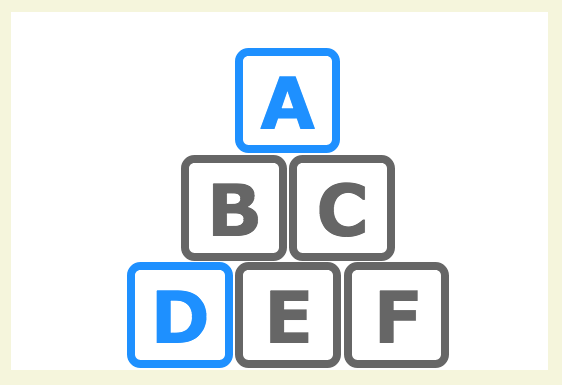
If you’ve made and applied the class “blue” correctly, your page should look something like the image below. If it doesn’t, try again.
The class “blue” was added to the letters A and D and to the border on the divs containing the letters. Why did this work? Why didn’t it add another border on the letters? The class doesn’t specify a weight or style for the border, only what color to use. Without a weight and style specified, a border will not be added to the letters.
Use More Classes to Add More Colors!
Make the B and F blocks red, and the C and E blocks green.Follow the same process you used to make the A and D blocks blue. When you’re done, view your page. It should similar to the one below (it’s OK if your colors are different than mine).

Validate Your Files
Once you have your pyramid working, validate your files. Use validator.w3.org for your HTML, and jigsaw.w3.org/css-validator for your CSS.
Quick Tips
Floats…
- Can be left or right. Use float:left or float:right.
- Can be cleared with clear:left or clear:right. Use on the first element in a row. Follow it with a float:left for float:right so the element will work with others in the row.
- Need to be consistent. All elements in a row must float or it won’t work. Floated elements don’t recognize non-floated elements.
- Will make an auto height container close up. Because the container won’t recognize floated elements inside of it. (Fix by adding overflow:hidden; to the container you want to force open).
- If you want to learn more about floats, Chris Coyner provides a simple, yet thorough explanation at All About Floats.
Margin and Padding…
- Is space. Margin is the space outside an element (and thus between two elements). Padding is the space inside an element (and thus between the border and content in the element).
- Can be used interchangeably at times. Which one you should use depends on what you need the element to do.
Classes…
- Can be used over and over.
- Can be used to modify an ID.
- If defined properly, can be used to modify different kinds of elements.
CSS Resources
- Problems? Check out my Frequently Asked Questions page.
- Need syntax for a property I haven’t covered? Try HTML Dog.
- Want a CSS cheat sheet (2017) at your side? Just download and print!
Project Resources
- Use the files I’ve started for you: building_blocks HTML and CSS.